travelogue - the venice architecture biennale 2010

XXIIth Venice Architecture Biennale
29.08-20.11.2010
Italy

First of all, a new year greeting to everybody - wish you an inspiring year ahead!

At the end of a long holiday after Christmas & New Year for most of us, the urge to plan the year ahead and carry out the plan in reality is probably be in your mind at some point over the past 2 weeks. To make it easy, it's always motivating to start with some travel incentives. Have you planned any art excursions ahead? The following may be useful: the Independent's must-see calendar 2011 for global art events. (If you would like to check out events within the UK, click on this instead)
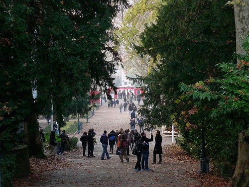
Visitors in the Giardini

Here is a retrospective of the Venice Architecture Biennale last year, focusing on the British personnel involved. According to the offical website, the event had attracted a record attendance of 170801 visitors, that means over 3 million euro of just entry-ticket sales (full price entry is 20 euro for an adult person). Attendance for its sister Art Biennale in 2009 was 375700, and who knows how much is spent for all the red carpets during the film festival. No wonder Venice can survive the rising sea level - just with its three Biennales!

Architecture Biennale - Kazuyo Sejima in Venice by BiennaleChannel - video link
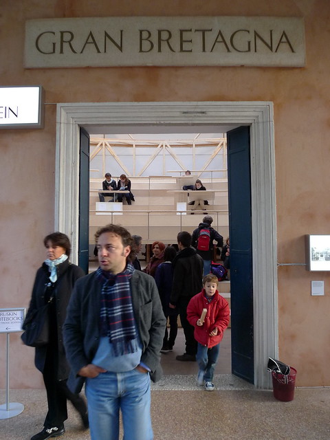
The British pavilion this year is commissioned by Vicky Richardson, Director of Architecture, Design, Fashion at the British Council and under the direction of muf architecture/art Llp. This is the official information from the British Council, how the commissioning process actually work? We don't have any further information from the page, so we cannot comment on whether the team selected has got the best idea. However, from observation, the British pavilion seems to be the only one who dedicated a significant portion of its exhibition to the host city, Venice, itself. And somehow this Villa Frankenstein (name of the British pavilion, which is also unique among the exhibitors that a name other than the country's name is provided) is quite fascinating indeed.
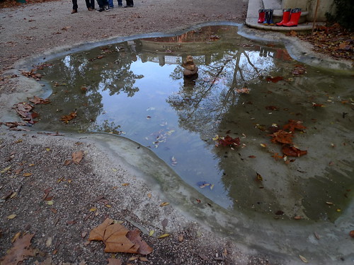
British humour displayed at the entrance - The Puddle, a concrete-formed pond & some paddington boots aside
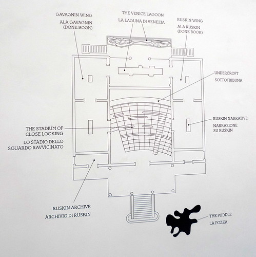
Plan of the pavilion

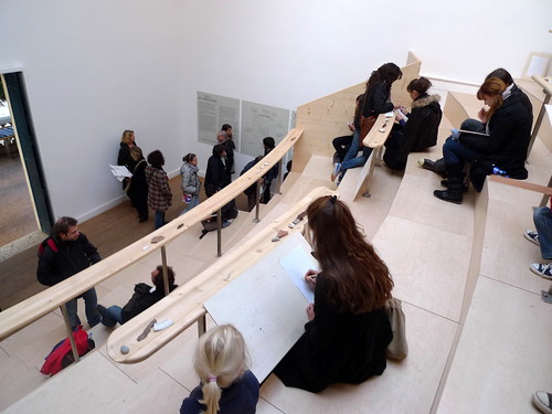
The Stadium of Close Looking - a 1:10 scaled model of the Olympic Stadium for London 2012, designed by muf architecture/art (London) and built by Spazio Legno (Venice) + Atelier One (London)
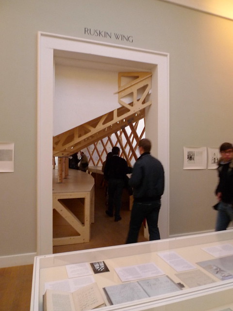
The Ruskin Wing - showcasing reference materials about the British Victorian social critic & historian of Venetian architecture John Ruskin
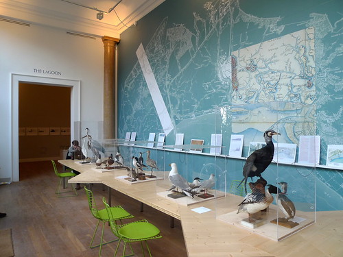
The Lagoon - displays illustrating the fragile eco-system in the Venice Lagoon
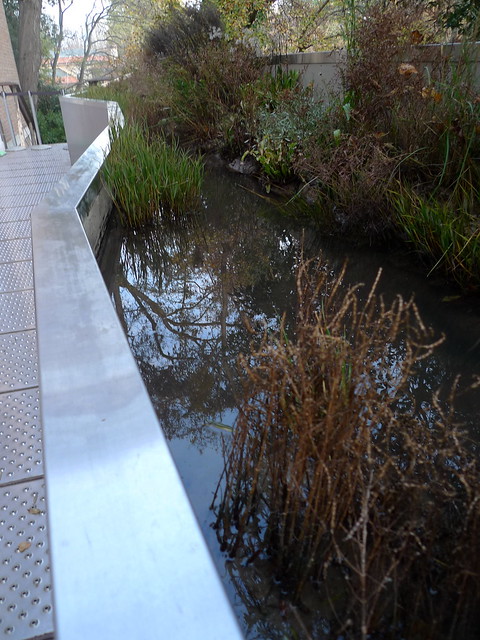
A 15 sq m. ecologically functioning slice of salt marsh in a tank showing a close‐up view of the native floral and fauna of the Venice Lagoon

You can see from the above, the UK pavilion is a collaboration between Venice and the British team, in terms of concept, contents as well as execution. It is quite an enjoyable and educational exhibition. Apart from the British pavilion, we also found Zaha Hadid's works featured in the Austrian pavilion -
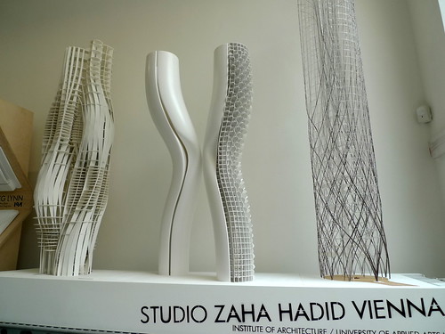
No matter you like her works or not, Zaha Hadid has now truly be recognised around the world such that her architecture is even featured in the pavilion of another country in the Biennale. This is a great achievement for herself and her office. Other british featured in the show are -
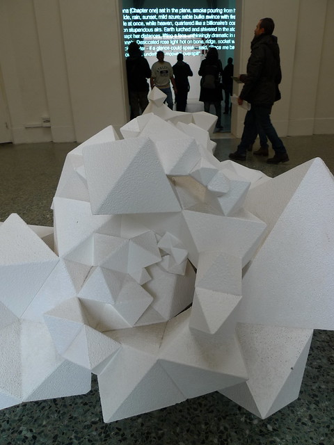
Joanna (chapter one), by Cerith Wyn Evans - the neon tube text at the background
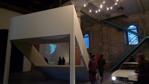
Tony Fretton's Piazza Salone with artist Mark Pimlott at the Arsenale

Tony Fretton at the Venice Architecture Biennale by Hugh Pearman - video link

If you would like to learn more about the UK's participation in every Venice Art or Architecture Biennale, check it out at this dedicated website by the British Council. Below are the full photo slide shows of the Biennale in the Arsenale venue, the Giardini venue and across the town.

*****

Further Readings -
Page: Official page for the Venice Architecture Biennale
Review: The sprawling Venice biennale offers frustrations and rewards by Oliver Wainwright for BD magazine, 31.08.2010
Review: RA Magazine Blog: Biennale diary by Kate Goodwin, 03.09.2010
Review: Cerith Wyn Evans at the venice architecture biennale 2010 by erica for designboom, 04.09.2010
Youtube: official youtube channel for the Biennale
Youtube: Hans Ulrich Obrist's series of interviews with all the exhibitors in the Biennale
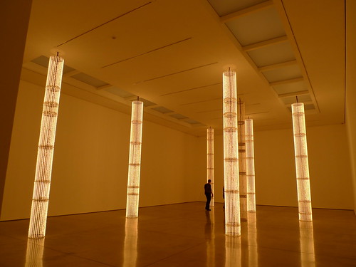
a multi-sensory minimal experience

Cerith Wyn Evans: ''Everyone's gone to the movies, now we're alone at last...''
White Cube Gallery (Mason's Yard)
till 22.05.2010

S=U=P=E=R=S=T=R=U=C=T=U=R=E ('Trace me back to some loud, shallow, chill, underlying motive’s overspill…')

The first thing that comes to my eye while I saw the exhibit above and learnt about this show from the Evening Standard (review link in Further Reading section below) was Pet Shop Boy's music video for their single Minimal. The second thought is why the title - ''Everyone's gone to the movies, now we're alone at last...''. Then from the official press release, I realised its title is from a song by Steely Dan, "Everyone's gone to the movies" in 1975. That's a reincarnation 35 years later, um...

The review from Evening Standard rated it 4 stars out of 5. So I have put the show in my to-do list before I forget about it totally and miss it at the end. And I'm glad that I have gone see it myself - it is a well-presented, powerful show with site-specific works that you would remember both the gallery and the artist altogether after your visit.

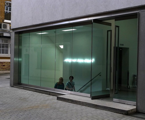
When you approach the gallery, there's a line of text made by neon tube next to the stairs -

Subtitle (2010)

But it is not meant to be viewed from this direction. Instead, it is to be viewed from within through the reflection via the glass -

Subtitle (2010)

The line of text move with your frame of view as you walk, and because of the frame of the gallery glazing it does look like a line of subtitle in the big screen with the view outside becoming the movie itself. The text of this piece also develops a remote link of helplessness to the title of the show - ''Everyone's gone to the movies, now we're alone at last...''

In the main exhibition space on ground level hung the key piece of the show: C=O=N=S=T=E=L=L=A=T=I=O=N (I call your image to mind). This is a fascinating collaboration of acoustic art and science. With a series of hanging mirror discs resembling the Calder's mobiles, strategically positioned loudspeakers and selected soundtracks, a spectacle is created with an atmosphere of sterile lab setting (helped by the white and silver palette). You constantly see yourself in the mirrors but your ears are receiving sound waves reflecting from the walls & mirrors projecting another dimension of flux on top of the visual illusion. It forms a multi-sensory maze which you have to be present inside the space in order to feel the work itself.

At the basement, there is a series of framed prints playing with the concept of positives and negatives with slots cutted on printed page of a poem. But another main piece is forcing you to accept its existence next door - because of the heat it generates and radiates across the space from the moment you reach the bottom of the staircase leading down from the ground level.

S=U=P=E=R=S=T=R=U=C=T=U=R=E ('Trace me back to some loud, shallow, chill, underlying motive’s overspill…') - video link

The gallery's press release cites this piece has referenced the former electricity sub-station which once stood on the site of the gallery. Whether that is clear or just a mere marketing gimmick phrase should be decided by the audience. I do think that it is relevant, with the gradual 'on-and-off' of the filaments in the "light columns" mimicing the movement of machinery in routine operations. The alignment of these 'light columns' are inspired by the order of stones in japanese zen gardens and stars in the galaxy, and gives a sense of serene beauty to the cubic space.

This is the first time I came across Cerith's works. I found a sense of connectivity of his works with another artist White Cube represents - Kris Martin. While 'time' is very much an explicit essence in Kris's works and he tries to convey the notion of time to the audience through his works; Cerith's works evoke the audience to acknowledge hidden dimensions in space with his operation in time. You couldn't determine the moment which sound emits from the speakers in C=O=N=S=T=E=L=L=A=T=I=O=N (I call your image to mind), it only reaches you after reflections from the wall and the mobile discs. That distortion in reception suggests an added dimension in space created by the artist to the original space as perceived by the audience. And in S=U=P=E=R=S=T=R=U=C=T=U=R=E ('Trace me back to some loud, shallow, chill, underlying motive’s overspill…'), the proliferation of heat radiating out from the works did cause me to think of the strong invisible electro-magnetic fields present in electricity sub-station, although that is not consciously realised by people in most cases. In that aspect, it has materialised something virtual in my eyes.

And that, has made the show worth visiting.

Further Readings -
Trip the light fantastic with Cerith Wyn Evans, review by Ben Luke for Evening Standard 19.04.2010
Review by Charles Darwent for the Independent 18.04.2010
Quote from Michael Archer on Cerith Wyn Evans on Parkett Issue #87
Art work created by Cerith Wyn Evans for Parkett
Official page of the show from White Cube Gallery