kinetica art fair 2010 - part 1

Kinetica Art Fair
04-07.02.2010
Ambika P3 Gallery
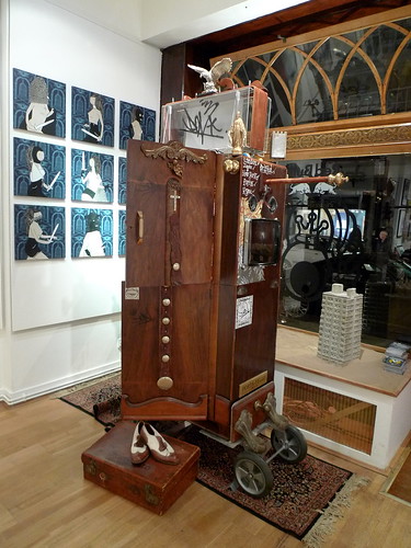
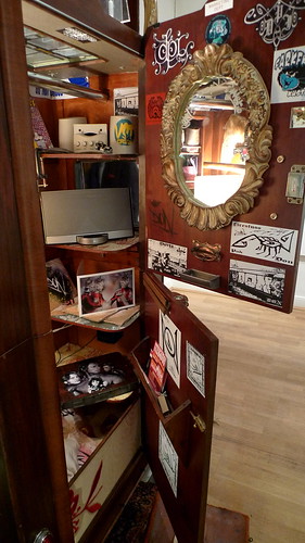
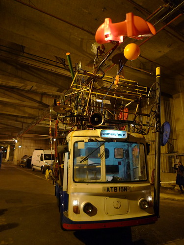
The jean tinguely-like milk float at the entrance

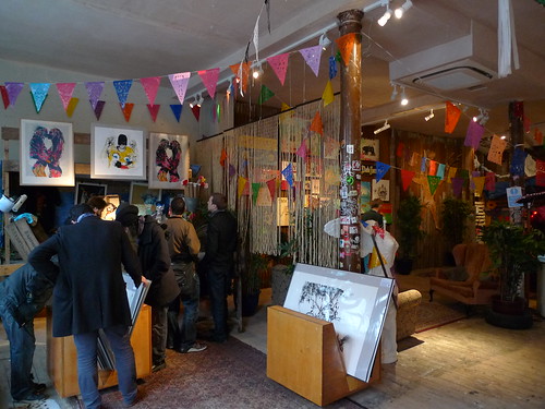
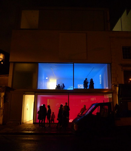
Kinetica Art Fair returns to London after its acclaimed debut last year. There are more live performances than last year, and from the turnout of the VIP preview this evening, interest is definitely huge among the public.

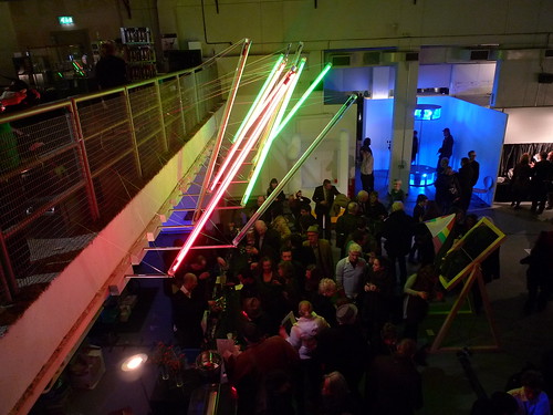
The bar area below the entrance
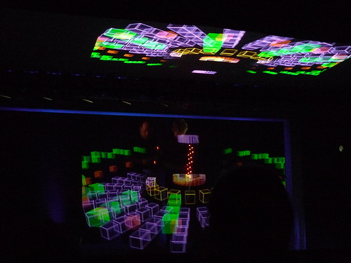
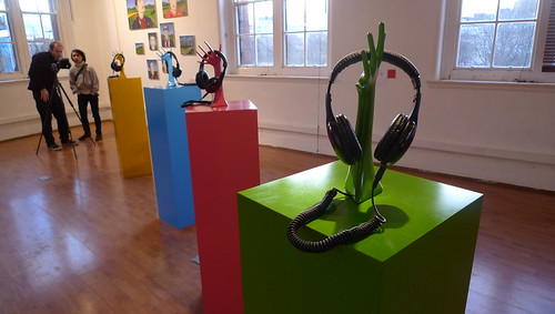
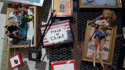
One of the Interactive exhibits - sonic-responsive LEDs

Apart from kinetic exhibits, there are also live performances

Read the reviews by various papers on Kinetica Art Fair's facebook page. More to come in part 2.

art january in london . part 1

Central Saint Martin MA Fine Arts Interim Show
29-31.01.2010
Bargehouse Oxo Tower Wharf

ma-fine-art-2009

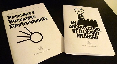
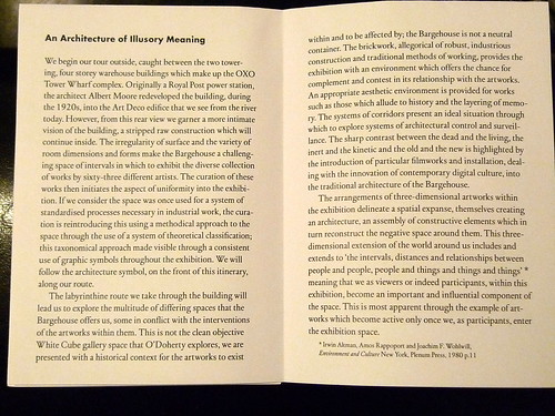
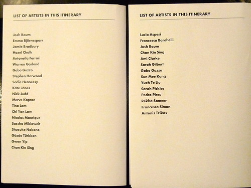
The show is curated by students from MA Critical Writing and Curatorial Practice, Chelsea College of Art and Design. They designed 7 itineraries for visitors if they select 1 to follow. The followings are samples of the iteineraries -

Due to limited time, we didn't really follow the suggested itinerary but go up floor by floor instead. The show included works from both full-time & part-time students. The space inside the building is quite interesting and each student seem to have sufficient space to display their little 'unfinished' masterpiece(s) -

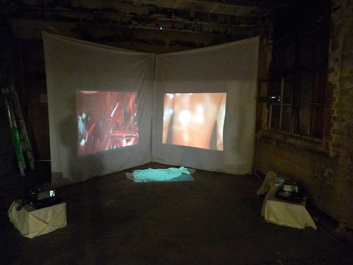
Video / Installation

Sound Art

Installation

Sound / Installation

Illustration

Installation / Performance (the performance is not available when we visited)

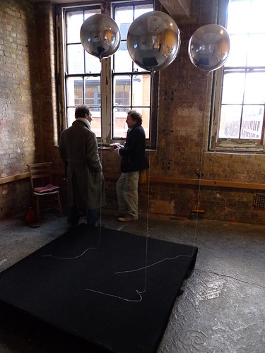
This is the piece I like most - 3 metallic balloon hold in mid-air by their own strings:

central saint martin MA interim show 2010 by you.

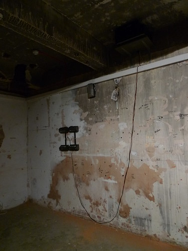
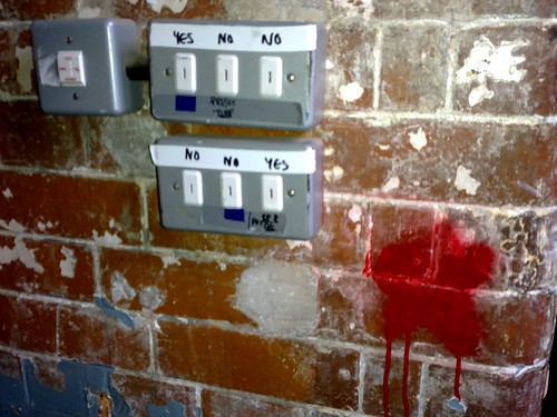
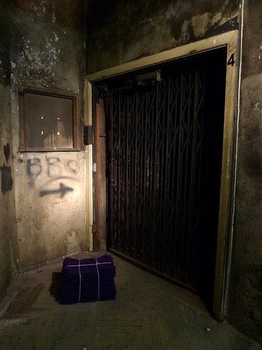
The venue itself is full of surprises, too -
 
Keen to see how their final masterpieces turn out later in September...

Full photo set here

art december in london . part 3

David Chipperfield - Form Matters
21.10.2009-31.01.2010
Design Museum

Sir David Chipperfield's show is ending tomorrow. If you have not visited yet and enjoy contemporary architecture with a minimal poetic vocabulary, you should not missed the chance to have a look at the English master's impressive display of drawings, photos and models of his works.

Americas Cup Building at Valencia

This video is not part of the exhibits in the show, but it could show how the real building looks -
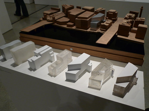
Model of Anchorage Museum at Alaska

Model display combined with John Morgan's illustration form the main focus in the show

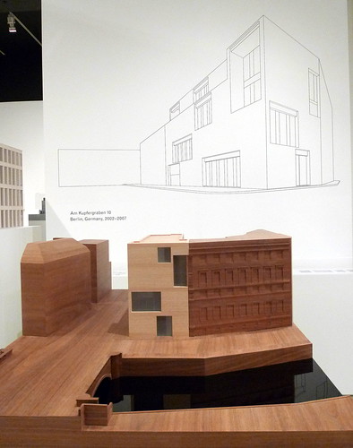
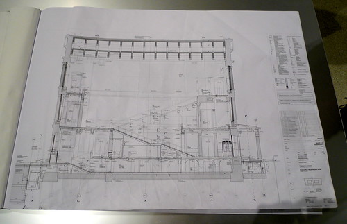
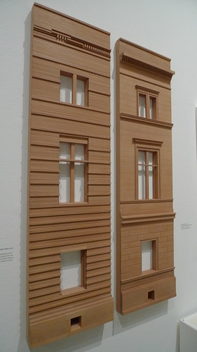
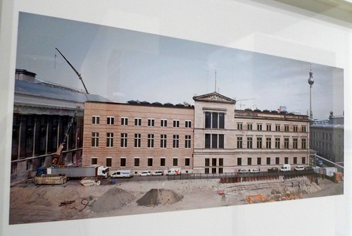
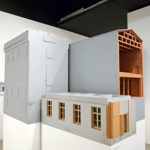
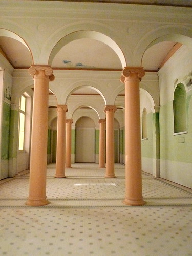
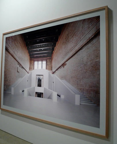
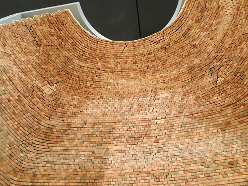
The most impressive project is the Neues Museum in Berlin. Chipperfield has paid due respect to the historic significance of the building, and at the same time create a spatial departure from the past to enable visitors to have a renewed experience of the building. There is an area dedicated to the project -

Drawings are displayed which has documented every detail of the building, new & old construction

Facade language

Site photo

Scaled model

Internal view of the scaled model

Photo of realisation

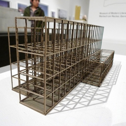
Scaled model showing the brick construction

And in case you do not know, he is a londoner :)

Full photo set here

*****

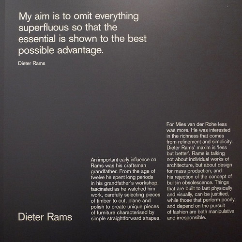
Less & More - the Design Ethos of Dieter Rams
18.11.2009-07.03.2010
Design Museum

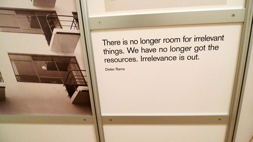
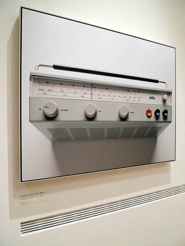
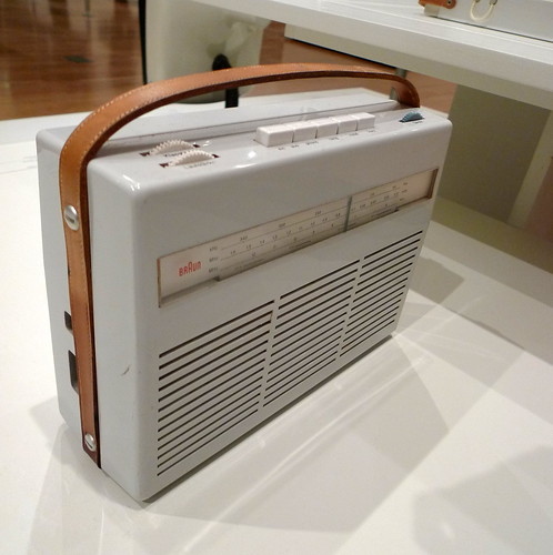
'Timeless' seems to be a cliché for design appreciation. Take a look at Dieter Rams's selection of products exhibited in the show, I see nothing more than a dedication to the essence of function and simplicity in the design. Everything he has made for Braun or selected for the show, they look so 'relevant' still even they are produced some 50 years ago.

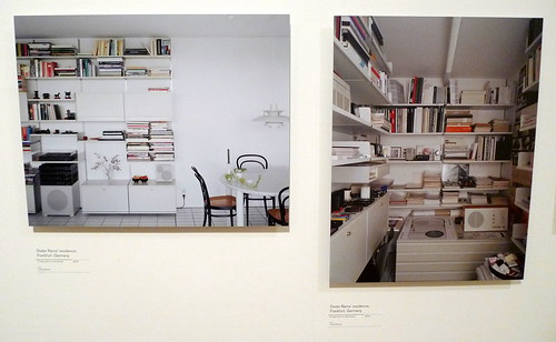
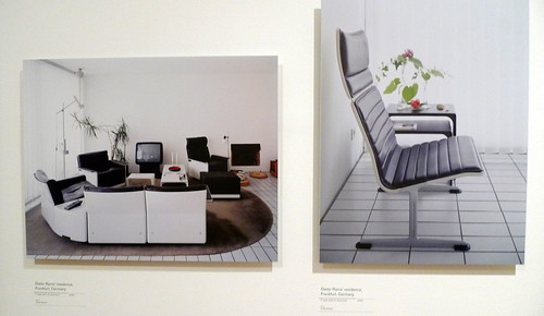
Dieter Ram's residence

Dieter Ram's residence

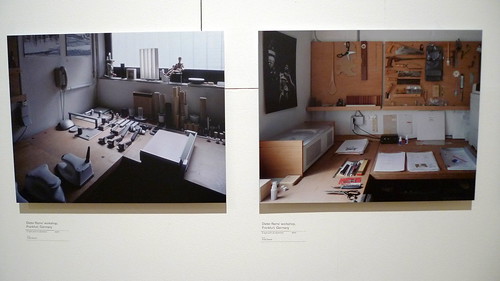
Dieter Ram's workshop

I think the reason why they look so 'relevant' is that the design has made it so intuitive you know what the product is for and how it works in your first look. There is no need to figure out where the operating buttons are or which button is for what function. And I guess this is what 'timeless design' means.

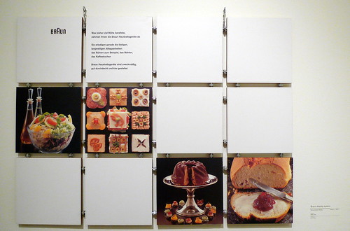
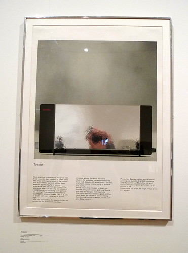
 Apart from the products, the exhibition also celebrates the propaganda of them. These posters strip out every possible graphical distraction such as slogans or logos, and give you the product itself as the only focus to appreciate its inner beauty.

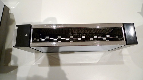
This is the toaster in real featured in the poster above

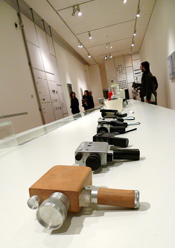
A range of camcorders

Exhibition set

A radio

Full photo set here

*****

Further readings -
Official website of David Chipperfield
Official page of Chipperfield's show at Design Museum
'Building Study - David Chipperfield Architects' Neues Museum, Berlin' by Ellis Woodman for bd magazine, 03.2009 (with video link)
Review from *wallpaper on David Chipperfield - Form Matters, 22.10.2009
'Neues Museum, Berlin' written by David Chipperfield Architects in Collaboration with Julian Harrap, photographed by Candida Höfer, published by Walther König. Available in ARTBOOK.com
Official page of Dieter Ram's show at Design Museum
Wikipedia entry for Dieter Ram
Video clips on Dieter Ram in vimeo
Interview with Dieter Ram by designboom.com, 10.10.2000

london art fair - part 1

London Art Fair
13-17 January 2010

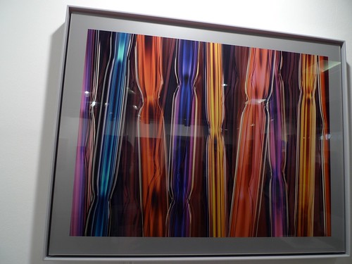
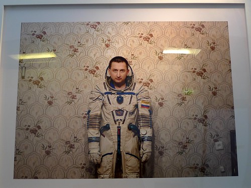
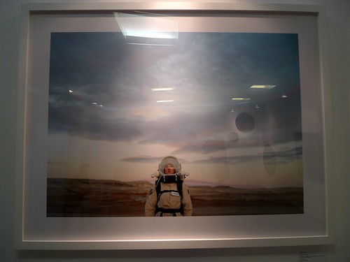
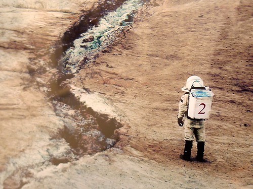
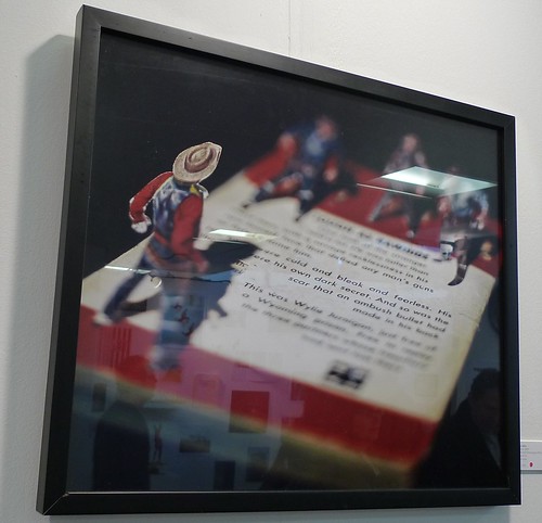
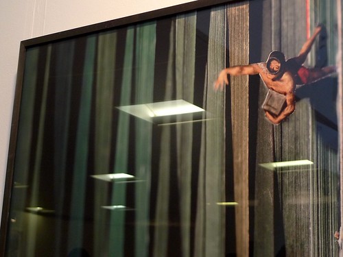
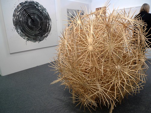
Following the previous post about Zoo Art Fair last year, below are my 10 favourite artists (in no particular order) from the London Art Fair so you could see how the two resemble / differ in terms of talents shown -

1. Chuck Elliott (UK)

2. MARCK

video link

3. Vincent Fournier (Belgium)


4. Thomas Allen (USA) 

5. Kevin Osmond (UK)

6. Francisca Prieto (UK) 

video link

8. David Mach (UK)

10. Yu Jinyoung (Korea)

More review coming up in part 2.

zoo art fair 2009

Zoo Art Fair 2009
Shoreditch, London
16-19 October

As the London Art Fair is opening this week, let's have a look back on the Zoo Art Fair last autumn, and see how different the two fairs would be. The discussion below would emphasize mainly on the fair experience, while the photos show some highlights of the exhibits.


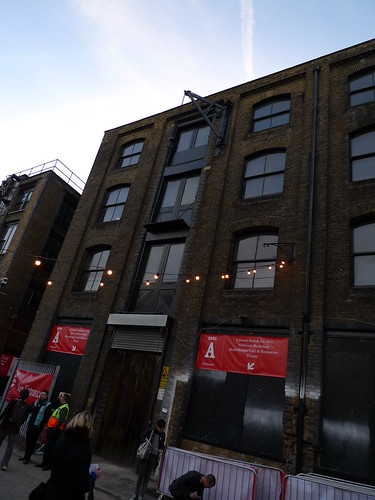
Entrance & exit of zone A

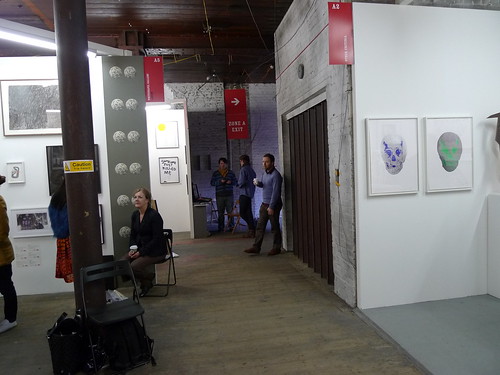
Zone A is made up of small booths for galleries. Interestingly ICA and the Serpentine Gallery also have a booth there. There are not too many booths in this area, and their size compared with the official cafe is a bit out of proportion. If the spatial layout permits, it would be good to have the cafe in the middle of a loop of small booths to increase the breathing space; instead of putting it in one side and squeezing all the booths on the other side.


Booths in zone A


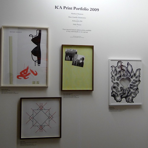
ICA is selling art prints to fund its programmes


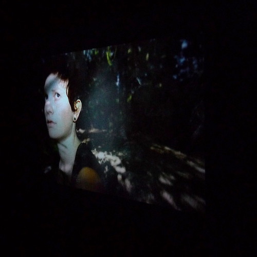
film showing at zone B

Zone B is dedicated to movies. While this gives a dedicated area solely for one form of art, it is  quite difficult to let a steady stream of visitors to watch every piece of videos duiring their stay. Perhaps due to budget and space limitations, only very few works could be shown on the projecting screen. The other works are shown on a small TV with a headphone. In order to give boarder exposure to the works, could they be streamed online in the fair's official website, say at least during the show period?

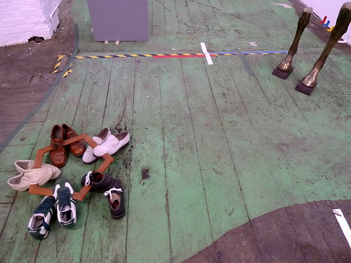
Installation and Exhibition Space in Zone C

Zone C is the most spacious among the 3 venues. And also it contains several areas of different characters. There is basement, ramp, rooms etc. for exhibitors to make their booth/display site-specific, and some did make an effort and did not disappoint to make an impression.


The space itself makes Zoo Art Fair worth the visit and of another character from Frieze in addition to the artists/works selection


Zuzanna Janin

video link


Lava (2008) by Takagi Masakatsu

video link 

Zoo Art Fair being hold at the same time of Frieze has got the advantage of the critical mass & all the media coverage. London Art Fair would undoubtedly be more focussed on local and regional works compared to the two, but being in London means works won't probably be confined to a local context. Already there is a strong emphasis and line-up on photography this year, with a day dedicated to this form of art which the public could easily relate to. It would also be interesting to see how the organiser arrange the space itself to make the experience worth re-visiting again.

Full photo set here

Further Readings -
Official website of Zoo Art Fair
Video Wall of thoughts from Zoo visitors at Winkball.com
Review by Nicholas Forrest (01.11.2009) at artmarketblog.com
Official website of London Art Fair

art december in london . part 2

It's the last weekend before Christmas, if you are still doing your last minute gift-shopping, the followings may be of some inspirations to help you out -

the Fiesta Resistance
Pictures on Walls at 46 Commercial Street
until 23.12.2009

Prints, Posters, Books, Paintings ... lots of different stuff you could get here

The Banksy work at the entrance

Full photo set here

*****

Flying Eyeballs
08-12.12.2009 (already closed)

The standalone shelf at the shopfront

Various items inside the shelf

Swallow composed of helicopters

Full photo set here

*****

Art for Kunst at Christmas Bazaar
The Old Truman Brewery
until 21.12.2009

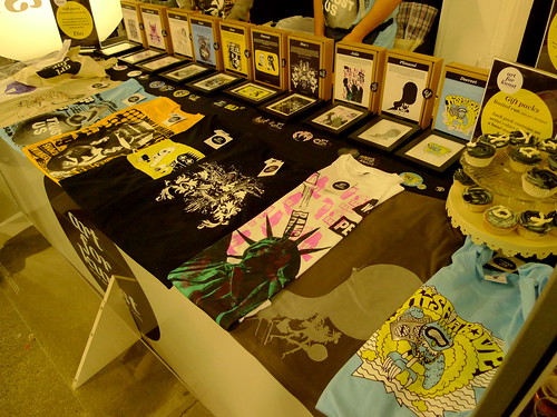
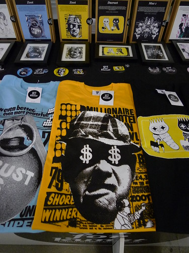
Limited edition sets of T-shirt and picture by various artists

Full photo set here

*****

New Acquisitions Show + Christmas Party (09.12.2009)
until 26.01.2010

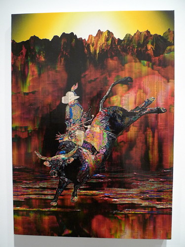
Minotaur 2 by Gordon Cheung

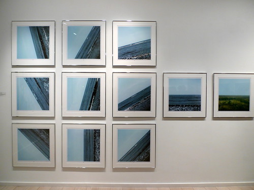
Sea 0° - 135° by Jan Dibbets

Full photo set here

*****

Further Readings -
Official web of Pictures on Walls
Flying eyeball press release at Alive-not-dead
Official page for Art-for-Kunst's christmas stall
Official web of Gordon Cheung

art december in london . part 1

Found - Stuart Haygarth
until 30.01.10  
Haunch of Venison

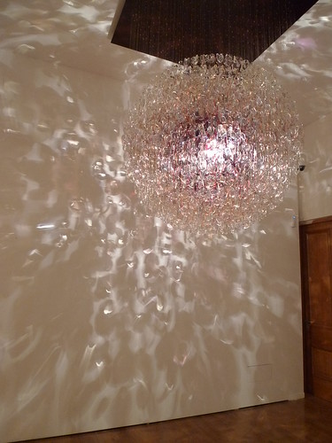
Optical (Tinted) Large (2009)

I have seen the works of Stuart Haygarth before in various fairs. The first time I came across his works in actually on a magazine about lighting. However, a click into his official website after my read led me to a fascinating world of spectacles that simply took my breath away.

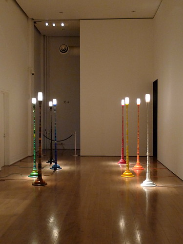
Lighthouse (8 individual works) (2009)

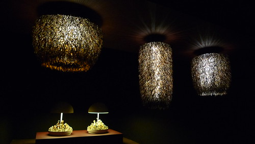
Top: Urchin (Fat); Urchin (Slender); Urchin (Thin) (2009)
Bottom: Raft (Dogs); Raft (Cats) (2009)

His works are all related to abandoned objects that he found everyday. Sometimes he creates a piece using them, the other times he made completely new work inspired by them.

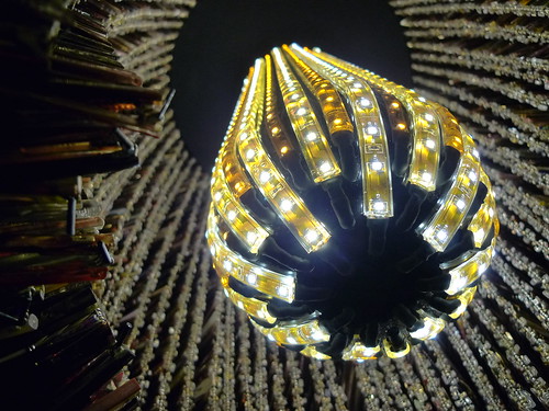
Close-up of one of the Urchins

And the moment you see these trivial, banal items being pulled together and form a new identity together, the feel is surreal. It is like the fairy tale of a frog turning into a prince in front of the eye of a princess.

Close-up of the cats in Raft

Top: Mirror Ball (2009)
Bottom: Barnacle (black) (2009)

Mirror Ball and Barnacle (black); both 2009 - video link

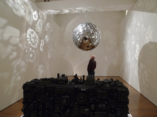
The mirror ball is created with smashed car wing mirrors Stuart collected from narrow roads and 'hot spots' in London. The moment you saw its revolving sparkles when you enter the room, you would not have thought of how many lives may have been lost or how much injuries may have been caused in each of these mirrors; and the stories that led to those. How scary we are admiring something which was actually created by dangerous behaviours of human that shouldn't have happened...

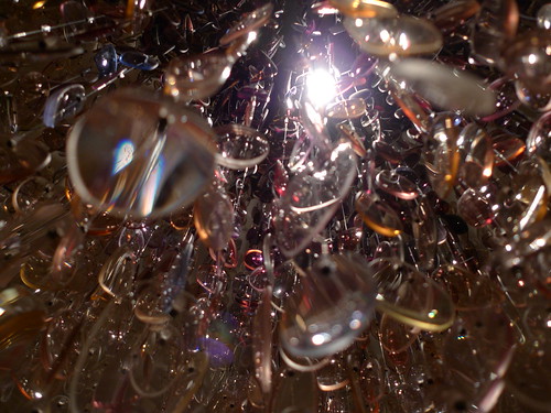
Close-up of the lens in Optical (Tinted) Large

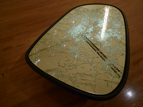
Wingmirror (2009) - with reflection of Magoo Chandelier (2009)

A thought come to my mind when I was watching the news about COP15 after I went to see this show. It is great that Stuart has recycled what is literally thrown-away rubbish-to-be in his works and made them 'reusable' again. Yet he still creates other works which is inspired by these objects but uses whole new materials. I'm not saying that is immoral, and at least it is better than some other artists who simply creates spectacles at all costs that have absolutely no concern about environment.

And even all these 'recycled' works are relatively low in carbon footprints, once they are snapped by galleries or museums, they would be transported around the world on different shows, which is very carbon-intensive in the journeys. Yet the art world seem to be blind in this way of operation, with virtually NO established museums or galleries in the world having any form of sustainability statement on how they would try to minimise their carbon footprints in commissioning, exhibiting or acquiring works (If you know of any, I will be very interested to learn about it and publicise it here). Isn't that shameful? Or is it that creative freedom should not be bound by any form of hindrance, including environmental concerns?

Magoo Chandelier (2009)

Full photo set here with more close-ups of all the works exhibited.

Further Readings:
Official website - Stuart Haygarth
Official page for the show at Haunch of Venison
art november in london . part 2

Exposure - Jane Brownuntil 06.12.2009  
Kings Place

In 2002 British photo journalist Jane Bown donated her entire collection to The Newsroom, The Guardian and The Observer's archive and 100 of her iconic black and white photographs - 50 of which have never been seen before - go on display in the Guardian News and Media galleries in Kings Place from 23 October. 

Self-portrait

Starting out at The Observer in 1949, Jane's first published portrait was of philosopher Bertrand Russell, she went on to cover a huge variety of topics from Glastonbury to Churchill's funeral. In 1985 she was awarded the MBE, going on to recieive the CBE a decade later for her outstanding contribution to photography. 

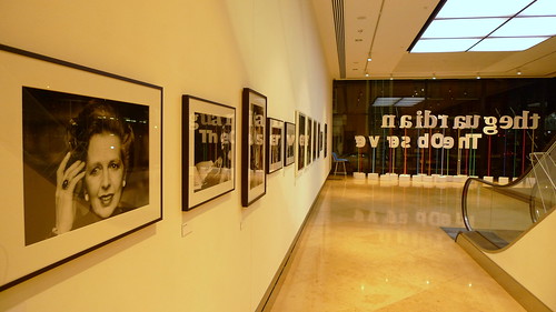
Part of the collection on display at the foyer of the Guardian's head office

She's been working for 60 years with the Observer, something which is as extraordinary in itself as her captures. Personally not a regular reader of the newspaper, I try to understand what this means. It shows that both parties must have some common beliefs that tie them together in addition to money and contract, which, could easily be better offered by a thrid party. Their co-existence probably brings synergy to their individual brands, and together their signatures re-inforce each other's works. 

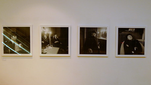
The Beatles

For those who haven't been to Kings Place, you may be glad to find there are 2 other galleries inside the building. The place also has 2 small music halls which have excellent acoustic performance. The galleries serve well as pre-or-post-concert activity. There is also outdoor dining along Regent's Canal, and an indoor cafe.

Full photo set here

P.S. Don't miss the interview link below if you want to know more about Jane as a person!

Further readings -
Official website of Jane Brown, with gallery of her photos 
Exposure by Jane Brown (book review) by Adam for knowphoto.com
Wikipedia's entry for Jane Brown, with links to pages about her in a few other websites
The eyes have it by Robin McKie for the Observer, 18.10.2009 - an interview with Jane

art november in london . part 1

Tatsuo Miyajima ���男 - Pile Up Life

until 16.01.2010
Lisson Gallery

"Colour-stained" facade of the gallery seen from opposite of the road

Sorry for the long wait - it's been a busy month but I managed to drop by a few shows. They would be featured here one by one.

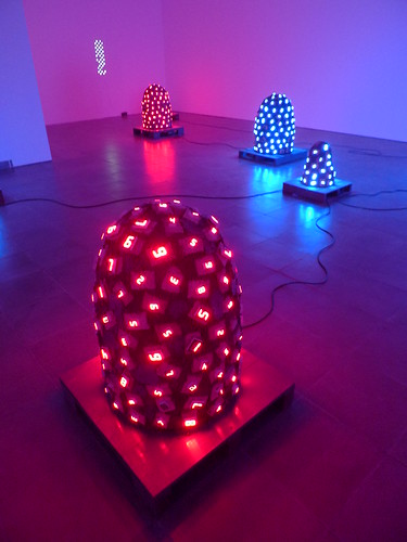
Tatsuo Miyajima's counting digit triggered a sense of anxiety, anticipation and thrill in Lisson Gallery on tuesday night. 

Pile Up Life (various) 2008

video link

C.F Counter Brain (various)
note: "C.F" stands for "Counter Fragile"

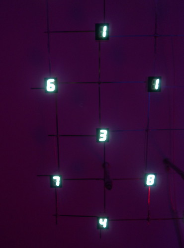
One may find clueless staring at these jumping numbers repeating the sequence from 9 to 1 or vice versa. But isn't life just as multi-faceted and clueless as Tatsuo's clouds of running digits? Amazing how he could sum up life in a bunch of wires and primitive counting!

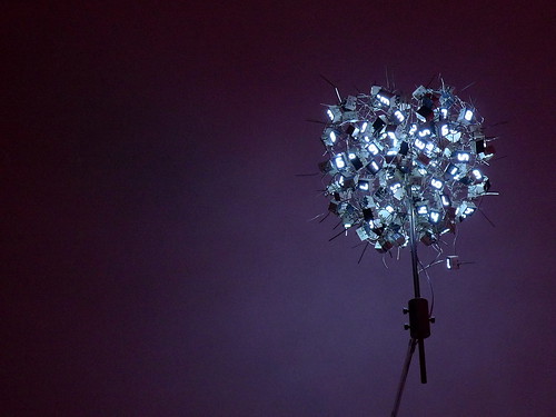
The cool blue-ish LEDs in the C.F Counter Brain series are actually quite in time for christmas. I won't be surprised if they are mass-produced and placed on shelves in Selfridges it could easily become a best-seller substitute for traditional christmas tree / flower.


C.F Lifestructurism (various) 2008

video link (video not very successful to show changing digits unfortunately)

video link

full photo set here

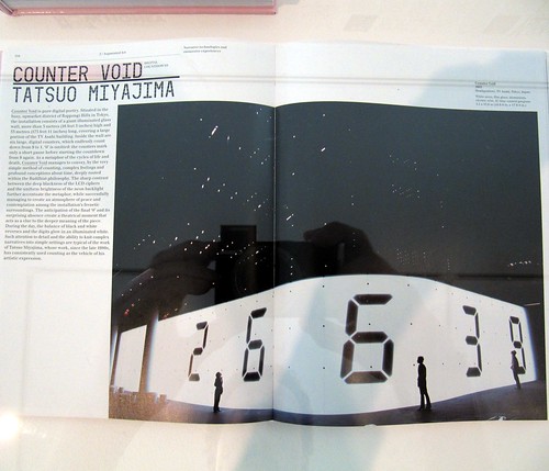
Tatsuo has been commissioned for public art in Roppongi Hills, Tokyo. His counting digits at the junction next to popular book store Tsutaya is one of the favourite photo spots of locals and tourists -


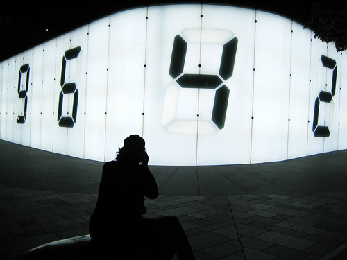
Tatsuo's work "Counter Void" (2003) at Roppongi Hills, Tokyo (image by hiromy)


Tatsuo's work "Counter Void" (2003) at Roppongi Hills, Tokyo (image by トリプ ・ tripu)

Further Readings
Official page for the show at Lisson Gallery
Official website for Tatsuo Miyajima
Limen at Royal Opera House (also covered by the Guardian here)
Review & Interview by Ben Luke for the Evening Standard, 03.11.2009
Video of C. F. Lifestructurism No.16 by owens096 

frieze art fair 2009 - part 2

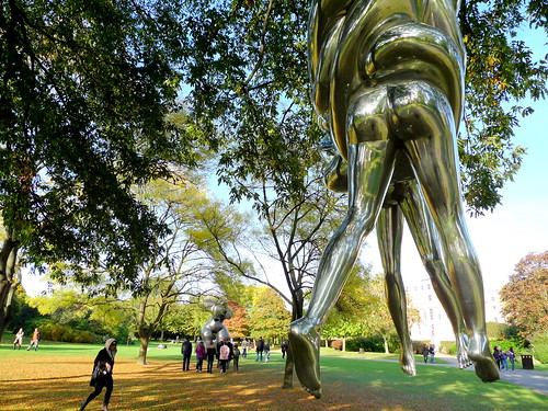
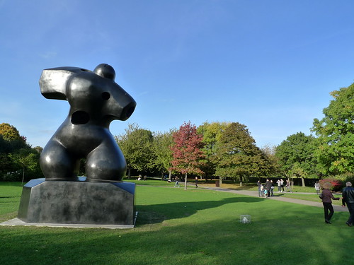
The Sculpture Park

Some say Frieze has become corporate, big, fancy and out of touch with the new scene throughout the years... whether you agree or not is highly subjective. Whoever said that Zoo may have stole some lights from Frieze in terms of excitement or alternative flavours, Frieze has undoubtedly retained its leading position - thanks to the sculpture park. 

I have to say that, without the sculpture park, Frieze would just be another generic fair around the world. One could feel really packed and dizzy within the pavilion with all the buzz going on - that is not saying it is bad. It is where you see the people (actually very much this aspect) and the works together.

In the park, the works re-gain the attention of everyone. The ample space between each installation gives room for one to appreciate each piece in his/her own way, without being disturbed/side-tracked. it is important for one to develop his/her own artistic judgement, this is paramount to foster the cultural advancement of a nation. 

The sculpture park provides the opportunity for this to happen. It is the royal botanical heritage of the Park that creates the tension and juxtaposition between the tradition & new, individual & collective, as well as human vs nature.

Perhaps I have exaggerated a bit above, but I honestly think the sculpture park supports Frieze to stay on the art map in the world. I'm sure the organiser understands this very well, and I would like to remind them that it is vital they keep on cultivating this delicious part of the fair every year, and keep this british heritage which you couldn't possibly find in another place.

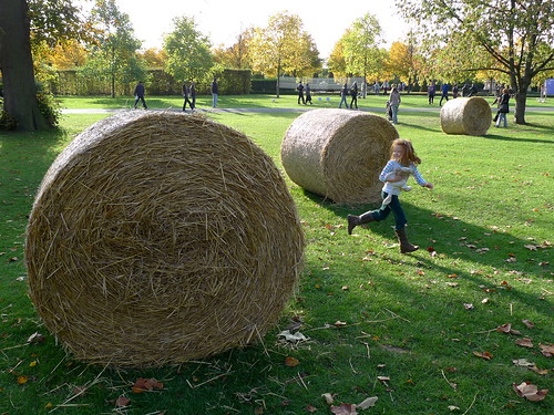
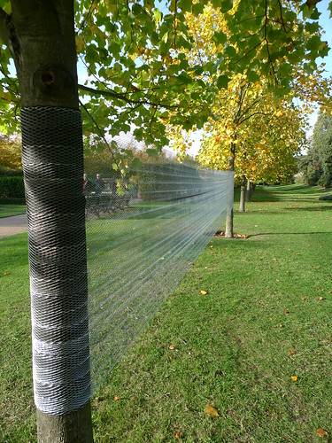
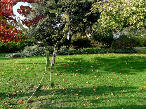
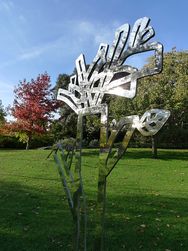
Here are some nice shots of what you have missed if you didn't visit the park last weekend -

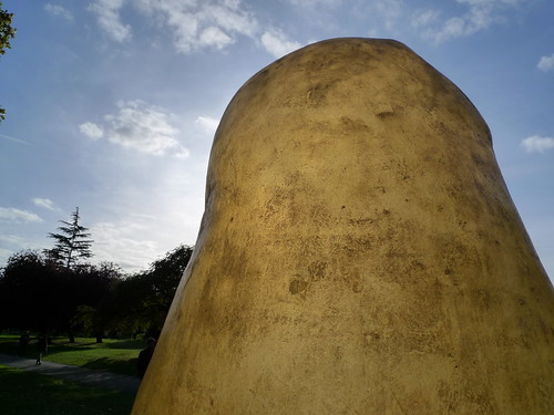
Artificial Rock No. 16 (2007) by Zhan Wang

Breast Berries (2009) by Maria Roosen

Pumpkin (2009) by Erwin Wurm

Someone and Someone (2009) by Eva Rothschild

Edawrd VIII (2009) by Graham Hudson

Bonsaipotato (2001/09) by Remy Markowitsch

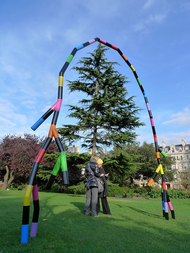
Grain Circle (2009) by Andrea Nacciarriti

Two Trees I & II (2009) by Vanessa Billy

A Child's Grove (2009) by Neha Coksi

The Couple by Louise Bourgeois - video link

Henry Moore Bound to Fail [Bronze] (2009) by Paul McCathy

Full photo set here

2 more clips of some works inside the pavilion -

Further reading -
Frieze art fair 2008 photo set (including show and sculptural park) here
Frieze Projects 2009 - interviews by The Art Newspaper