interview with the berliner luft duo

Berliner Luft
the Residence Gallery
03-26.06.2011
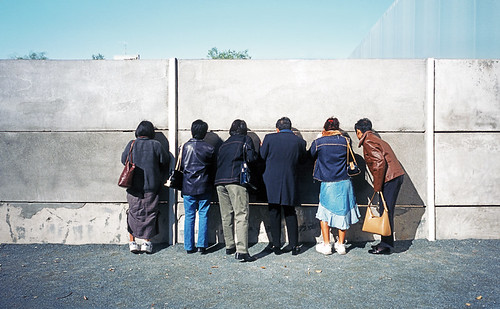
 

The Wall (All rights reserved by the photographers)

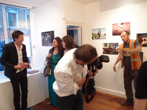
The photographers with the guests in the private view opening evening

Famous for its lively art scene, Berlin is undoubtedly Europe's capital of art production over the past decade. Residence Gallery has brought a photography show from Germany to London this month featuring the reborn German capital in the eyes of two young(-ish) german photographers Benjamin Tafel (BT) & Dennis Orel (DO).

Alexanderplatz (All rights reserved by the photographers) 

Originally from Stuttgart and studied visual communications in Weimar, both Benjamin & Dennis are award-winning members of the Art Directors Club, which is a global organisation for visual communication professionals. Here is a short interview with the two photographers about their exhibition -

Coming to Berlin (All rights reserved by the photographers)

Q1: Who were the people featured in the photos? Are they residents of the neighbourhood or just models? Do they have a say in how they are featured?

A: All the people we are shooting with had a background or connection to the situation or location. Our aim was to stage the situations but never lose the connection to reality. The coincidence plays an important part in our work to keep the people in their part of the real life and not to fall in a pose like a fashion model. Our purpose: Everyday life is theatre.
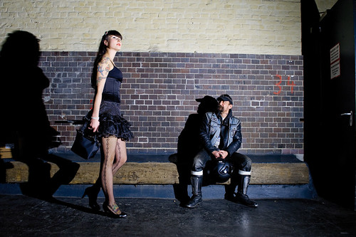
Girl Passing by  (All rights reserved by the photographers) 
 
Q2: There's an overall tone in all the photos - colours with some kind of hard contrast (or even conflict) and a deliberate use of flash. What is the reason for this take?

A: The use of a calculated composed light is our way to shape out the location or the people to gain a new interpretation out of it. Its a  way of remodelling it with light to stage a situation which shows the viewer a far side. Using the light in this way boosts our graphical view that we use in our work.
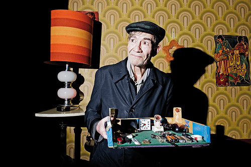
Konrad Tönz (All rights reserved by the photographers) 

Q3: If you have to pick your favourite neighbourhood in the city, which would it be?

DO: One of the interesting places right now is in the western part of the city. The bird view from the Top of the Pan Am Lounge. To one side into the penguin area at the Berlin Zoo and to the other the naked people jumping in the rooftop-pool of the "Europa-Therme".

BT: It depends what you're looking for. The southeastern part of Kreuzberg is one of the hotspots at the moment. You still find a neighbourhood that has grown over decades, but a lot of new spots and young creatives move there. The mixture you find there is the key. Turkish greengroceries next to young galleries next to a typical Berlin drinking hole. Because everyday life is theatre!


Video by the Residence Gallery

The duo also has another photo exhibition currently in Kunstschwimmer Berlin called Hundesalon running till 08.07.2011.
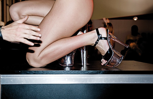
Girls at Stutti (All rights reserved by the photographers) 


View Larger Map


*****

Further Readings -
Page: Official facebook Page for Berliner Luft
Page: Official Page of Benjamin Tafel
Page: Official Page of Dennis Orel
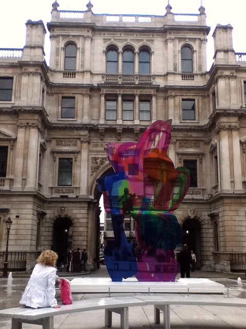
summer exhibition 2011

Summer Exhibition 2011
The Royal Academy of Arts
07.06-15.08.2011

It's time for the annual pilgrimage of art fans in town to the Royal Academy of Arts (RA) for its Summer Exhibition. Some key observations are -

1. There is a lack of digital works - only 6 videos are included in the last room; and while works in all other media are displayed on their own physically, these 6 videos are all squeezed in a tiny monitor screen. Not sure if the artists selected are happy about such arrangement - is that fair to them, dear curator? Or, would it also be the own fault of digital artists that they don't bother to submit works to the Summer Exhibition and hence the fewer quality works to choose from by the curator? And has RA considered placing more  emphasis on emerging formats which connects with the younger audience? Is video art not profitable enough to get more attention?

2. The RA-only installation room curated by Michael Craig Martin is pretty impressive, although some people argue it is merely a branding exercise rather than promoting lesser-known talents. Well, given the total number of works displayed in the show and the price RA charges for entry, it seems fair to have a blockbuster room to satisfy the audience with a taste for big names.

3. Most rooms are still just only displaying works in the same medium, curators are not taking the efforts to select works from different media to compose his/her story. The way which RA picks curators may be the cause of this phenomenon - if these people are not multi-media artists, they would tend to look into works in the medium they practise. However, this does not necessarily benefit the audience - look at how amused people are in the room curated by John Wragg after they walked through 5 other rooms with drawings & prints only in the left wing.

4. The artists' books series is awesome and all the selected works are of high quality and craftsmanship.

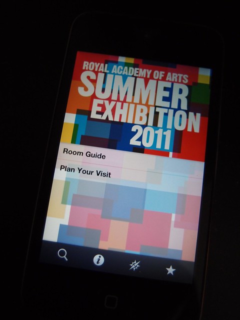
5. For those who has a smart phone and intend to visit the show, remember to download the official app before you go. For those who cannot visit the show in person, this £1.19 app could provide a virtual guided tour and over 50 streaming video clips to let you know more about the show.

6. If RA is going to take the Haunch of Venison portion of the Burlington House back for its expansion, it should consider allocating more rooms for the show to give curators more freedom to compose their stories.

7. Although RA is opening late on fridays till 10pm, it is advisable to get up early over the weekend instead if you plan to visit but are not able to do so on weekdays. We love the play of natural daylight shining into the rooms which gives a sense of celebration to the works, rather than the cold artificial light casting on the works after dark which feels like suspect interrogation.

Here are our top picks for the Summer Exhibition 2011 (in no particular order) -

Self Portrait with Budget Box (Red & Black) by Cornelia Parker
Butterfly Army by Frederick Higginson
Untitled (2011) by Edmund de Waal
Monogramm by Georg Baselitz
Meyer's Encylcopedia, Volume II by Alexander Korzer-Robinson
Funnel by David Nash
Bullet Drawing 2011 by Cornellia Parker
Joseph's Leonarvilions by Karl Singporewala
Dog in a Bin by Simon Brundret


View Larger Map

*****

Further Readings -
Page - Official page for the show in RA's website
Review - The Royal Academy Summer Exhibition 2011: A Culture Show Special, BBC2 (via iplayer, available within UK until 12:19 24.06.2011)
Review - by Alastair Sooke for the Telegraph
Review - by Ben Luke for the Evening Standard
Review - by Mark Sheerin for Culture24
Review - by Gillian Darley for the Architect's Journal

new meanings to classic entities

Fearful Sphere by Sam Knowles
Simon Oldfield Gallery
11.05-11.06.2011

The Great Enterprise (2011) - in-situ installation

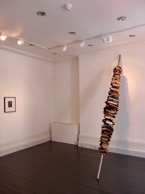
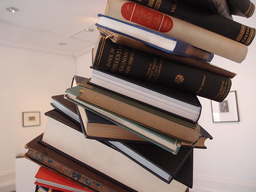
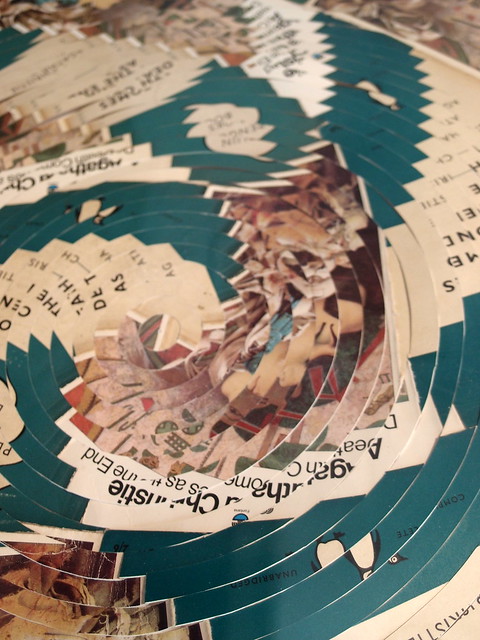
Managed to catch Sam Knowles's 1st solo show on the last day. Seeing Sam's works in Simon Oldfield's gallery feels like walking in the fantasy of a maverick writer's residence. The physical twists he made from vintage books are like a whimsical mind liberated from the written thoughts in these publications.

The Great Enterprise (2011) - in-situ installation

overview of the show - video link

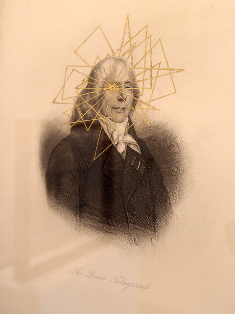
The Prince of Talleyrand (2011)

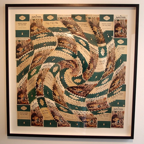
There're 2 general directions to which Sam detours the meanings of the classic entities - treating them simply as a 2D canvas predefined with meanings and applying gold plates on that; or treating them as patterned 3D raw materials and arranging them in ways to create a twisted perspective.

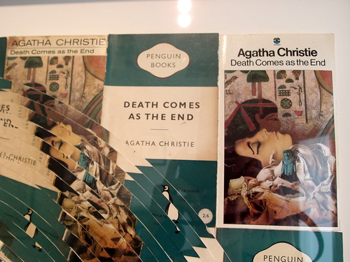
Death Comes as the End (2011)

Death Comes as the End (2011) - close up

Death Comes as the End (2011) - the 3 book covers used

In today's world of flooding symbols & icons, Sam has re-discovered the hidden classics in everyone's bookshelves and made them into relevant objects again - after all, who would spend a day to read a book today?

Full photo set


View Larger Map

*****

Further Readings:
Page - feature post by Aesthetica, 11.05.2011
Page - official page of the show in Simon Oldfield's website
Page - official page of the artist

the fragile act of balance

I Did It My Way and Took the High Way by Alejandro Almanza Pereda
13.05-11.06.2011

Hoxton square is becoming an essential gallery circuit recently with power player White Cube as well as 20 Hoxton Square (which has hosted a show brought in by Mario Testino earlier this year), the yet-to-be-rebuilt-by-zaha-hadid ROVE (founded by New York art dealer Kenny Schachter), the newish Ibid Projects relocated from the Vyner Street circuit and the funky multifunctional space KK Outlet (a communications agency with a gallery and bookshop). Each of them has its own character but they all bring in exciting shows all the time to visitors who may be just coming over to enjoy a picnic in the lawn. Even though you may not be a huge art fan, it seems often that you can find one show you like among these galleries around the square.

Burning the Candle at Both Ends (2011)

Take the current show in ROVE for example. It has joined force with Fundacion Magnolia to launch this 1st UK show of Mexican artist Alejandro Almanza Pereda. The exhibition includes new commissions and recent works in the form of installations, video and drawings.

After All These Years I Realise That it is Better to Live Outside the Garden with Her Than Inside Without Her (2011)

Known for questioning and challenging the rules of physics Alejandro fiercely explores the concept of gravity in his work. Relentlessly pushing these boundaries, Almanza Pereda relies purely on the forces of resistance to hold his works in place. He also religiously searches through flea markets, gathering used objects, many with local historical connection and others with the global presence of mass market goods. 

People that Live in Glass Houses Should Not Throw Stones (2011)

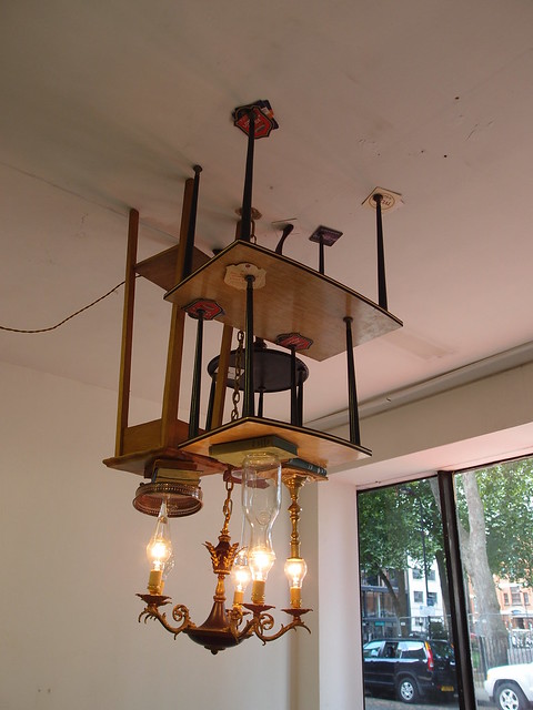
The gallery staff told us Burning the Candle at Both Ends(2011) by the entrance window (the top image above) is an on-site creation which the artist has spent almost a week finding the balance to hold the objects on the ceiling lamp. It was a pity we visited only after the artist has left London. Below are 2 interviews a few years ago -

Interview with the artist for his exhibition in Minneapolis Minnesota by TheSoapFactory, 08-01-2008

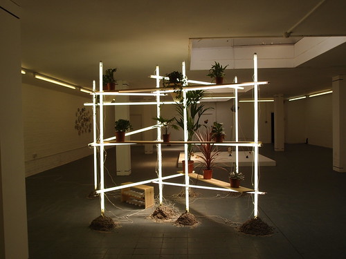
Alejandro with one of his neon tube construction in this interview by jun60mx, 12-02-2007

Alenjandro's way of creating art can be said as resembling the ancient nomadic tribe - wherever he goes, he would cultivate there and harvest his crops to make a living. It can also be said as organic - the ultimate appearance of his sculptures is largely decided by the force of nature, not his own will. In these gravity defying installations, the universal and the individual co-exist beautifully.

Full photo set

*****

Further Readings -

Page: Official website of the artist
Page: Profile of the artist in Magnanmetz Gallery

two distinct neighbours - part 2

The Space Between by Nigel Hall
31.03-14.05.2011

Stretched/compressed (2006)

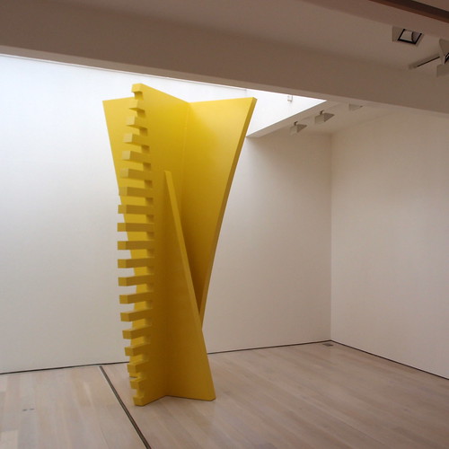
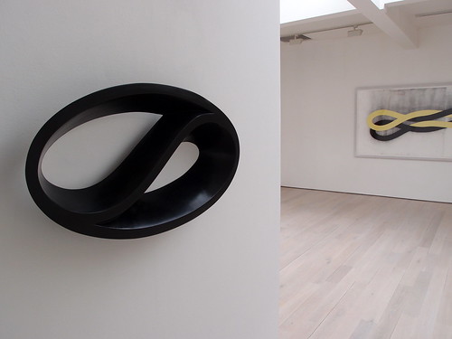
Next to its ground floor neighbour Blain|Southern, Annely Juda is a gallery specialising in 20th century art and working artists producing minimal or geometric works. The show we attended is the 10th solo exhibition of british artist Nigel Hall.

front - Chinese Whisper (2010); back - Drawing no. 1546 (2010)

The minimal, smooth geometric forms in Nigel's works under the rooflight has an uplifting spiritual feel compared to the near-gothic dutch designs next door in Blain|Southern. Nonetheless, it is an interesting juxtaposition and one can feel the change in zeitgeist on the difference in works by artists in two generations.

video link

There are charcoal & gouache paintings as well as sculptures made by various materials in the show. Observing the play of different forms on the 2D paintings and the 3D sculpture is an enjoyable exploration through the show, way better than trying to find the differences of certain Hollywood movies have in 2D or 3D formats.

Full photo set

*****

Further Readings -
Wiki: Entry for Nigel Hall
Page: Official page for the show in Annely Juda's website

two distinct neighbours - part 1

The Curious Image by Jeroen Verhoeven
12.05-16.07.2011

The 2 pieces exhibiting at the gallery's space in 21 Dering Street

There are two galleries adjacent to each other in Dering Street, Mayfair - Blain Southern & Annely Juda. Their shows are not really the same dish but it's interesting to see them both together.

The Blain Southern is the offspin from Haunch of Venison's founders Rory Blain & Graham Southern, and it has been producing some cool shows with great reviews since its opening but we haven't checked it out yet in person bizarrely until now. We missed out, obviously.
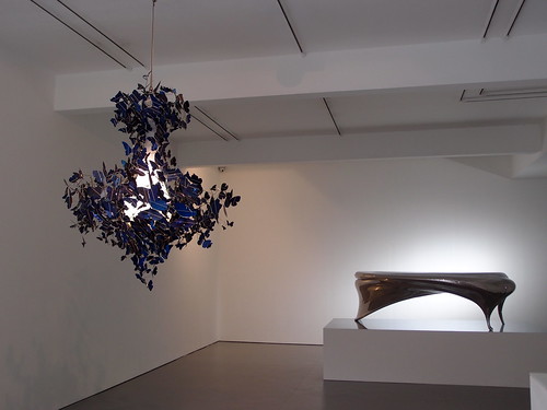
In the current exhibition with Jeroen Verhoeven, the gallery is showcasing the dutch designer, whose design house Demakersvavn is famous for making use of technology in design with a playful twist (common among dutch designs). Increasingly contemporary art galleries are exploring ways to increase their pool of represented talents (and those with larger profit margins), product design is a field which was absorbed into the mainstream art world. The boundary between installation art and interior design has diminished rapidly with star designers increasingly pursue personal art projects with galleries or commercial brands. After all, what defines art is very subjective, and works with high quality should be welcome and those galleries which sources them are worth mentioning for credit.

In this show, two pieces are shown - a table and a lamp. Not your average ones, of course. Within the amazingly crafted table, two silhouette portraits of the artist’s design collaborators, Joep Verhoeven and Judith de Graauw, are subtly shaped into its undulating surfaces. The construction of the table is exposed at the back of itself, where normal design products would usually conceal these as if it is trade secrets.

panoramic view of Lectori Salutem (2010) - video link

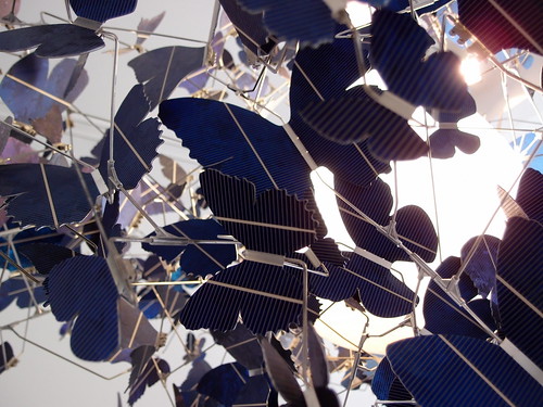
As for the lamp, it gets its power source from the butterfly-shaped solar cells. Instead of real moths destroying themselves flying towards a bulb, these artificial butterflies actually make the lamp alive. A contradiction in its own existence (as you won't probably need a lamp when there's light to power up the solar cells), it makes a beautiful art piece even though impractical to be mass produced as a product.

Virtue of Blue (2010) - close up

Full photo set here


View Larger Map

*****

Further Readings - 
Page: Official website of Demakersvan
Review: Jeroen Verhoven's show by designws.com

Travelogue - Berlin Paris spring 2011

During the Easter + Royal Wedding double long weekend getaway, we escaped to Berlin & Paris and here are 4 shows which we like, 2 of them are from London artists.

*****

Andy Harper - Truthwall
Morgen Contemporary
29.04-18.06.2011

Andy Harper's previous show in Danese - 02.11.2009 video by ballenato63

Full photo set

*****

Sterling Ruby - I am not free because I can be exploded in any time
Sprüth Magers Berlin
08.04-28.05.2011

Overview of the show - video link
Full photo set

*****

James Franco - 
Peres Projects Berlin
12-22.04.2011

Close-up view of one of the Exhibits

Overview of the exhibition set in Peres Projects' Kreuzberg Gallery - video link

Full photo set

*****

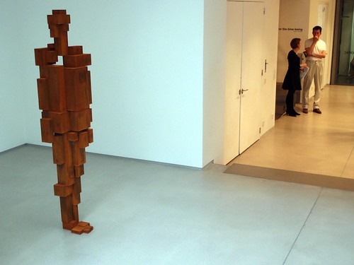
Antony Gormley - For the Time Being
Galerie Thaddeus Ropc
30.04-04.06.2011

State (2011)

the MEME series (2011) - video link

Full photo set

*****

Further Reading -
Page: official page of Andy Harper's show in Morgen Contemporary Berlin
Page: official page of Sterling Ruby's show in Sprueth Magers Berlin
Page: official page of James Franco's show in Peres Projects Belin
Page: official page of Antony Gormley's show in Galerie Thaddeus Ropc Paris
Video: Liftstyle Sterling Ruby, 25.02.2011 by evanlamos

the miniature world of little people

Concrete Ocean
Slinkachu's solo show at Andipa Gallery
03.03-02.04.2011

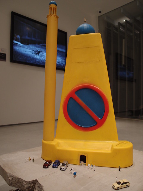
Managed to see this fabulous new solo show of miniature artist Slinkachu on the last day earlier this month. It has been two and a half years in the making since his debut solo show in Soho, summer 2008.

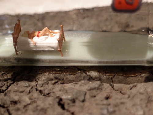
Relationship in a Bottle (2011)

Slinkachu has once again applied his sense of humour to fabricate intriguing scenes in an urban background. The show features a good mix of street art he actually created outside the gallery (and then photographed as limited edition prints) and standalone installations produced without physical site context.

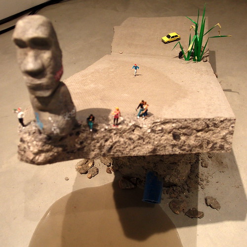
Natives (2011)

Although most of the installations are surreal at first sight (this is partly contributed by the use of brightly colour model human figures as subjects of the scene), there is some sort of irony and reality in each installation, which adult viewers would find it bitter while kids just love the toy-like nature of them.

Sustainable Living (2011)

Check out the following clips and the list of further reading :)

Full photo set here


View Larger Map

*****

Further Readings -

Page: Official page for the exhibition in Andipa Gallery's website
Page: Official blog of Slinkachu
Review:  "Street art scales down: why Cordal and Slinkachu are masters of miniature" by Tom Lamont for the Guardian
Video: Slinkachu's work at Belsay Hall by Benjamin Wigley
Video: Little People in the City (by Slinkachu), by theguywhowatchmovies

a showcase of peruvian talents

Bruma
20 Hoxton Square
24.03-30.04.2011

20 Hoxton Square Gallery brought a selection of emerging artists from Peru to town in this collaboration with Revolver Gallery & Mario Testino. Mario is an avid supporter for this gallery in his hometown, and would like to showcase their artists to the British audience. ‘Bruma’ is the spanish word for veil or cover. The show includes works by artists Miguel Andrade Valdez, Jerry B. Martin, José Carlos Martinat, Ishmael Randall Weeks and Giancarlo Scaglia. 

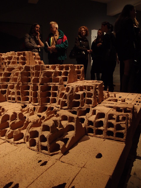
Huaca (2010) by Ishmael Randall Weeks

This sculpture by Ishmael Randall Weeks is made by bricks and looks like a miniature of an anicent town in a mountainous region with dwellings craved out from the rock/mud.

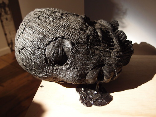
"Untitled 1 (Emesis Series)" (2011) by Giancarlo Scaglia

This body-less head from Giancarlo Scaglia is made by garbage bags and evokes a sense of terrorist and the everyday conflicts of guerilla fighters with local authorities, usually depicted by the media. (not saying this happens in Lima now, just a thought)

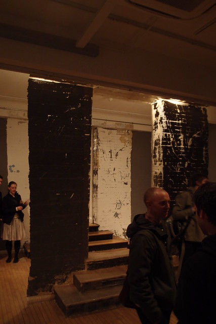
Superficial exercise #9 (2011) by Jose Carlos Martinat

There are also site-specific works by Jose Carlos Martinat in the show. This once above is a cast version of the opening & stair in the room, pelt-off from its origin and hung up on its own. These is a security man warning people not to walk onto the steps :)

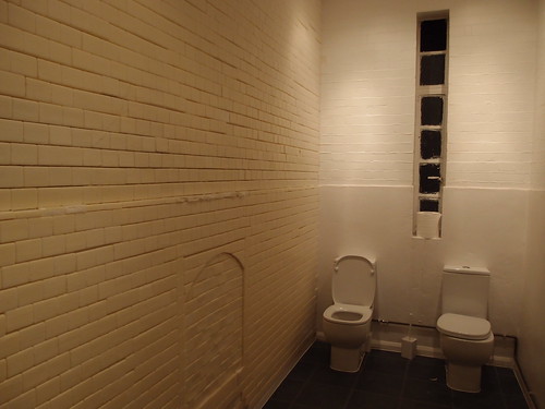
Apart from the exhibition, the toilet of the gallery is also a must-see. The wall on the left as shown above is apparently made of soap or wax - quite impressive!

Full photo set here

*****
Further Readings -
Page: Official page for the show in Galleria Revolver's website (english/spanish)
Page: Official page for the show in 20 Hoxton Square's website
Page: Mario Testino's 15 favourtie galleries - vogue.com, 20.12.2010

when a splash falls on the matrix

Psycho Boogie - Rory McCartney
Arch 402
25.03-28.04.2011

Come Clean (2011) by Rory McCartney

I do not know who Rory McCartney is until I came to see this show. Apparently he is london based, and is also the art director for Arena Homme Plus Magazine, which I was a dedicated reader a few years back (not any more for I have to implement a magazine spending cut after the crunch, and I don't have time to read all these magazines I bought any way). He has been commissioned by TfL for Platform for Art and has works shown in the Royal Acadmey of Arts and the V&A museum previously.

Hey! Hey! Can you Relate? (2011) by Rory McCartney

Them That's Not (2011) by Rory McCartney

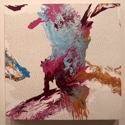
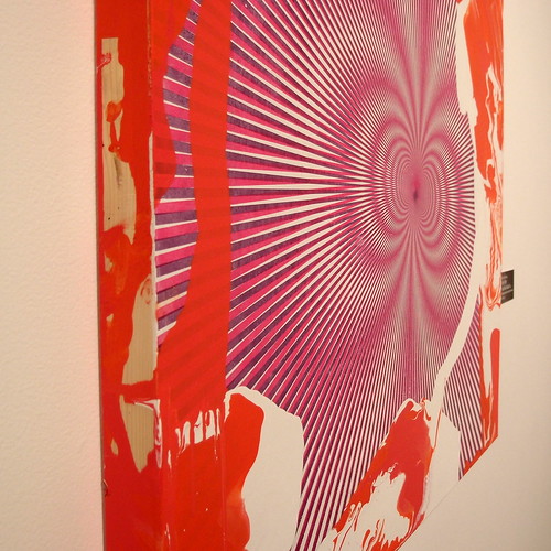
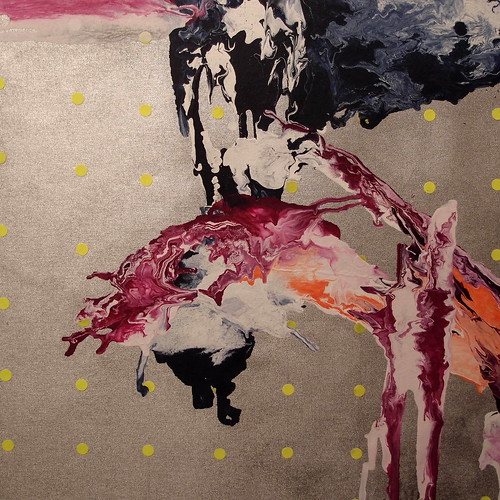
The works in this show are all composed of a juxtaposition of random organic splashes on a geometric background.  The contrast is very powerful - there is a sense of life seemingly jumping out of the canvas. Some pieces are vividly colourful, some pieces are confined to 2-3 tones only. Overall it is abstract and very graphical in nature, and all these brit bands out there should ask Rory to design their vinyl covers like these!

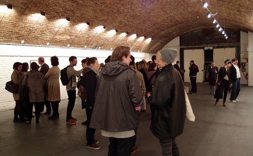
Opening reception at Arch 402, a new-ish gallery right next to the Hoxton Overground Station

Full photo set here


View Larger Map

*****

Further Reading -
Page: Official page for the exhibition at Arch 402's website
Page: Official website of Rory McCartney