the annual summer exhibition

by Suzanne Harb

Summer Exhibition
Royal Academy
09.06-17.08.2014

Joshua Reynolds, the first president of the Royal Academy, once said; ‘a room hung with pictures is a room hung with thoughts’. This year over 1,200 thoughts from artists like Martin Creed and Michael Landy to unknown artists grace the walls of the main galleries of the Royal Academy. Having had to whittle down the 12,000 digital submissions would have been a Goliath task. However what remains is a look into the various disciplines that represent contemporary art today. 

Now, the Royal Academy’s Summer Exhibition often get’s some stick from esteemed critics from the larger publications and across the board reviews are varied. What is interesting is how much discourse this annual exhibition (now in it’s 245th year) can encourage. With all those who attended making their own personal assessments as to which deserve to be labeled the good, the bad and the ugly. It is for this reason along that I love it! Due to the nature of the exhibition, it attracts such a varied audience thus opening up channels of communication between people and uniting them through their discussion of art. 

Providing a dissection of what is happening in contemporary art right now the Royal Academy is by the artists and for the artists. This is an incredibly powerful approach as it means no boundaries are put up in relation to prestige, style and approach. A plethora of current topics are tackled, it is almost like thumbing through the pages of a world new paper. Interestingly a piece titled FGM by Angela Braven is an example of how art continuously shines its light on contemporary issues. Depicting the horrors of Female Gentile Mutilation, and highlighting the ever widening divide in opinion regarding the matter, the inclusion of works such as this is vital as it highlights art fearlessness to tackle such issues head on.

What was in 1769, an exhibition open to the public was a pioneering and exciting, a notion that we take for granted in 2014. However the rooms curated in that traditional salon style are a means of acknowledging the exhibitions 18th century roots (and a technique very much needed to showcase the sheer volume of works). Gus Cummins RA was responsible for the curation of the Small Weston Room as well as room VII. Hung densely from floor to ceiling in a complex grid, works are clustered together as to produce some unexpected dialog among themselves, interesting juxtapositions and placements revealing more of a narrative.

Cornelia Parker RA has curated the Lecture Room. She has invited many high profile artists and Royal Academicians to contribute works in keeping with her black and white theme. With many artists creating new works especially for this space, she has created an exciting and dynamic cohesion of works. This room is playful yet sleek and provides a break from the busy rooms that preceded it.

While there is a great deal to take in, one drawback of the exhibition is that it is lacking in its representation of the more unusual artistic mediums. With a large percentage of the 1,262 pieces being taken up by paintings, and while sculpture does indeed stand out against the painted sea of works, we have yet to see the inclusion of performance art. In addition to this there is very little video and not near enough sculpture to be representative of the vast and varied approached to art today. While this is an important observation, I do not want it do detract form the wonderful experience it is walking through a room engulfed by art. Wondering and meandering through peoples thoughts is something very special. While you may not love everything on display the chances are you will find something that moves or amuses you. 

*****

Further Readings -
Review: "The Royal Academy Summer Exhibition: The anarchy and ecstasy returns" by Zoe Pilger for the Independent, 02.06.2014
Review: "Royal Academy Summer Exhibition, review: 'not so much old or new as exhausting" by Mark Hudson for the Telegraph, 06.06.2014
Review: "RA's Summer Exhibition: A sprawling exhibition of varying quality" by Will Gompertz for BBC Arts, 04.06.2014
Review: "First Look: the Royal Academy's Summer Exhibition" by Ben Luke for the Evening Standard, 02.06.2014
summer exhibition 2011

Summer Exhibition 2011
The Royal Academy of Arts
07.06-15.08.2011

It's time for the annual pilgrimage of art fans in town to the Royal Academy of Arts (RA) for its Summer Exhibition. Some key observations are -

1. There is a lack of digital works - only 6 videos are included in the last room; and while works in all other media are displayed on their own physically, these 6 videos are all squeezed in a tiny monitor screen. Not sure if the artists selected are happy about such arrangement - is that fair to them, dear curator? Or, would it also be the own fault of digital artists that they don't bother to submit works to the Summer Exhibition and hence the fewer quality works to choose from by the curator? And has RA considered placing more  emphasis on emerging formats which connects with the younger audience? Is video art not profitable enough to get more attention?

2. The RA-only installation room curated by Michael Craig Martin is pretty impressive, although some people argue it is merely a branding exercise rather than promoting lesser-known talents. Well, given the total number of works displayed in the show and the price RA charges for entry, it seems fair to have a blockbuster room to satisfy the audience with a taste for big names.

3. Most rooms are still just only displaying works in the same medium, curators are not taking the efforts to select works from different media to compose his/her story. The way which RA picks curators may be the cause of this phenomenon - if these people are not multi-media artists, they would tend to look into works in the medium they practise. However, this does not necessarily benefit the audience - look at how amused people are in the room curated by John Wragg after they walked through 5 other rooms with drawings & prints only in the left wing.

4. The artists' books series is awesome and all the selected works are of high quality and craftsmanship.

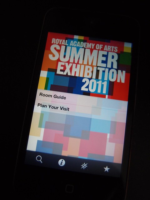
5. For those who has a smart phone and intend to visit the show, remember to download the official app before you go. For those who cannot visit the show in person, this £1.19 app could provide a virtual guided tour and over 50 streaming video clips to let you know more about the show.

6. If RA is going to take the Haunch of Venison portion of the Burlington House back for its expansion, it should consider allocating more rooms for the show to give curators more freedom to compose their stories.

7. Although RA is opening late on fridays till 10pm, it is advisable to get up early over the weekend instead if you plan to visit but are not able to do so on weekdays. We love the play of natural daylight shining into the rooms which gives a sense of celebration to the works, rather than the cold artificial light casting on the works after dark which feels like suspect interrogation.

Here are our top picks for the Summer Exhibition 2011 (in no particular order) -

Self Portrait with Budget Box (Red & Black) by Cornelia Parker
Butterfly Army by Frederick Higginson
Untitled (2011) by Edmund de Waal
Monogramm by Georg Baselitz
Meyer's Encylcopedia, Volume II by Alexander Korzer-Robinson
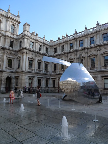
Funnel by David Nash
Bullet Drawing 2011 by Cornellia Parker
Joseph's Leonarvilions by Karl Singporewala
Dog in a Bin by Simon Brundret


View Larger Map

*****

Further Readings -
Page - Official page for the show in RA's website
Review - The Royal Academy Summer Exhibition 2011: A Culture Show Special, BBC2 (via iplayer, available within UK until 12:19 24.06.2011)
Review - by Alastair Sooke for the Telegraph
Review - by Ben Luke for the Evening Standard
Review - by Mark Sheerin for Culture24
Review - by Gillian Darley for the Architect's Journal

art july in london - part 2

Summer Exhibition - Royal Academy of Arts

triton III by bryan kneale by you.
Triton III by Bryan Kneale

triton III by bryan kneale by you.

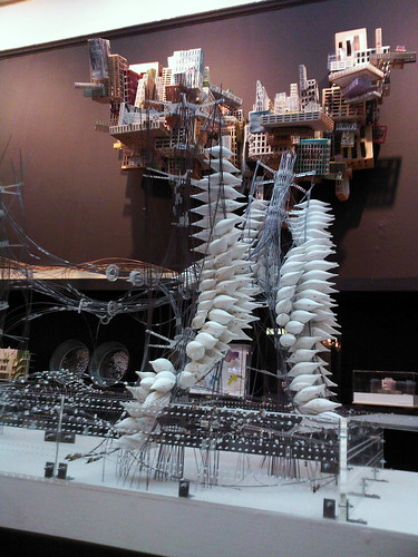
As usual, the summer exhibition in Royal Academy of Arts is promised to be a show with a great variety of works. However, I have to express my disappointment over the layout in the Architectue Room (Room VI). In the past, one could easily get close to the architectural drawings and models to appreciate the level of details they possess. Not any more this year. The room is packed like a warehouse, with 3 levels of shelves along the wall. It is impossible to reach at least 1/3 of the exhibits. Is RAA trying to accomodate as many works as possible for sole profiteering (they get 30% commission of all works sold in the show)?

summer exhibition . royal academy of arts by you.
Works cramped altogether in the Architecture Room

summer exhibition . royal academy of arts by you.
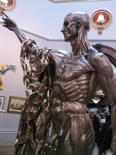
Saint Bartholomew, Exquisite Pain by Damien Hirst

*****

Joel Shapiro at 23 Saville Row

23 saville row by you.

23 saville row by you.

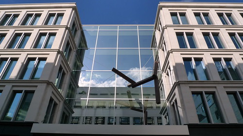
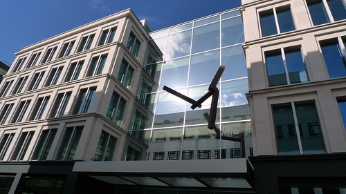
American artist Joel Shapiro was commissioned to produce an installation at the entrance of the office-retail development. His free-floating forms standing out sharply from the monolithic facade of the building. The reflective glass around produce even more drama on these 'flying' tubes.

*****

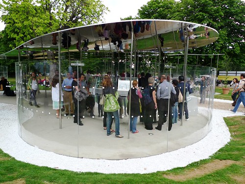
Serpentine Pavilion 2009

serpentine pavilion 2009 by you.

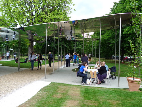
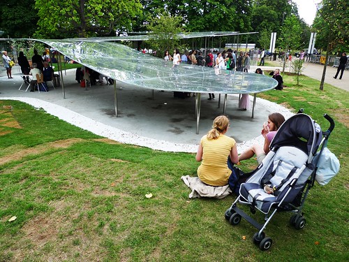
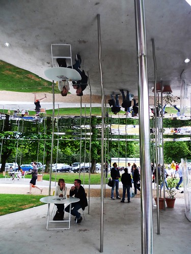
SANAA designs the Serpentine Pavilion this year. Ryue Nishizawa of SANAA says, "The pavilion is designed to amplify the way things look." The enormous mirror-finished aluminium roof definitely could make it happen - unless you are a blind. You see EVERYTHING twice once you walk near the pavilion, because the mirror image and its original subjects are reciprocal to each other.

You could see how the pavilion is constructed through time in this wonderful website. Now I start to feel sorry for the roof cleaners with the amount of pigeons around!

serpentine pavilion 2009 by you.
People relaxing on SANAA-designed furniture

serpentine pavilion 2009 by you.
The lowered polished aluminium roof attracts kids to play beneath

serpentine pavilion 2009 by you.
The cafe area - people queuing for drinks

serpentine pavilion 2009 by you.
Many slender steel poles to support the roof - some pokes fun of the absence of pole dancers

full photo set here

Further reading -
Official website of RAA's Summer Exhibition 2009
Royal Academy of Arts page on Triton III
Bryan Kneale page in RAA
Official website of 23 Saville Row, see the 'Art' section for the creation process of Joel Shapiro for the installation.
Installation process of Joel's sculpture
Official profile sheet of 23 Saville Row from its architect Eric Parry Architects
An interivew with Joel Shapiro by Robert Ayers in 2007
Official page of Serpentine Pavilion 2009
An interivew with SANAA by designboom.com in 2005
Review of SANAA's pavilion by Jonathan Glancey of Guardian UK