Serpentine Gallery Pavilion 2011
by Peter Zumthor and Piet Oudolf
01.07-16.10.2011
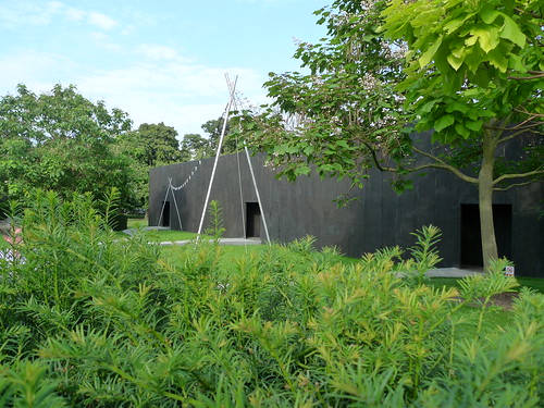
The black box exterior has a reclusive swiss flavour often found in Zumthor's architecture
To enjoy the annual Serpentine Pavilion under the summer sun is not something you can plan to do in a weekend, because of the english weather. But in the latest edition of the Pavilion series which began 11 years ago, we conclude that the pavilion has equal charm whether you're going there on a sunny or rainy day (but probably not so good if it's overcast).
While Jean Nouvel's signature red pavilion has never tried to blend in the surrounding landscape, Peter Zumthor's pavilion is by no means relating itself to the gallery next to it either, although it is much more understated. However, when we see pictures of this year's pavilion online under the rain, the rain doesn't simply fall along the roof - it transforms the pavilion when it glides along the roof. A curtain of water dripping from the roof down divides the seating area and the central garden, giving the whole experience its Zumthor's touch of zen.
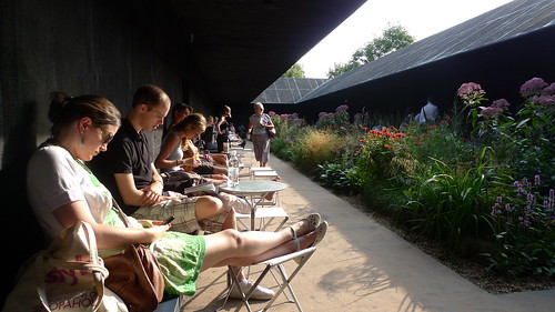
The 'secret garden' reveals once you walked into the pavilion
The highlight of the pavilion is the flowers in the central courtyard. And they are best experienced when the sun is present. So if you come to visit the pavilion on a sunny day, you will not be able to feel the effect of the rain on the architecture. And if you come in a rainy day, the blossoming flowers would be less vivid than they are under the sun.
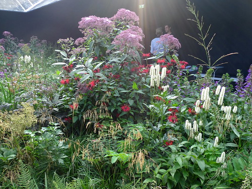
Dutch landscape design Piet Oudolf's selection of plants capture every visitor's admiration
Serpentine Pavilion 2011 - video link
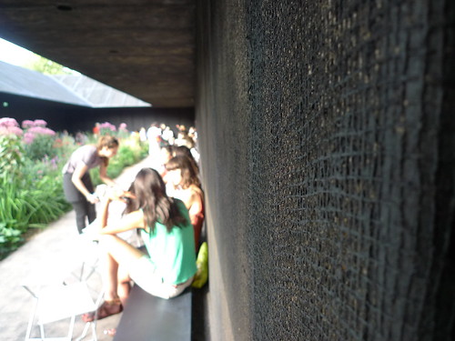
Texture of the walls
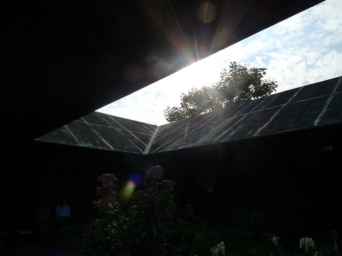
The sun beams through tree shades and the pavilion's roof
Full photo set here
*****
The Mirror of Judgement by Michelangelo Pistoletto
Serpentine Gallery
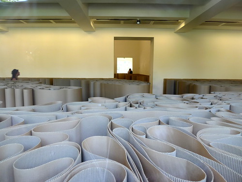
12.07-17.09.2011

Michelangelo Pisolleto's use of ordinary corrugated boards has a distilling effect of calmness despite the lack of order in the folds of the boards
The exhibition inside the Serpentine Gallery is equally dramatic as the Pavilion's floral show. Italian artist Michelangelo Pisolleto created a labyrinth path experience within the gallery and placed objects at several stops within the maze. The random nature of the corrugated board folds resembles the organic variety of the flowers in the pavilion.
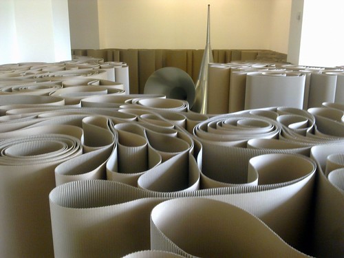
The gallery is transformed into a maze
Both the pavilion and the exhibition have invited the visitors to indulge in a journey of discovery and re-discovery, creating a subtle link which one may not realise in the beginning but connect to the element of labyrinth in traditional european gardens. We truly enjoy this co-incidental surprise.
*****
Further Readings -
Page - official page of the Pavilion (2011)
Page - official page of the exhibition
Review - Piet Oudolf's garden at the Serpentine Gallery pavilion by Joanna Fortnam for the Telegraph, 29.07.2011
Review - by Florence Waters for the Telegraph, 28.07.2011
Wiki - entry for Piet Oudolf
Archive - blog post on Serpentine Pavilion 2009
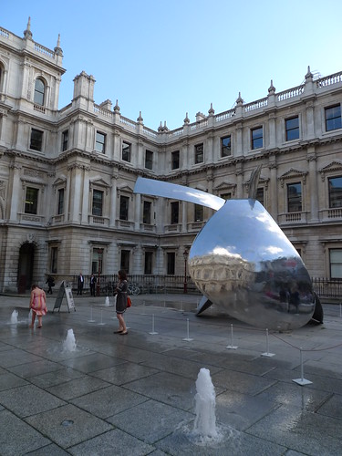
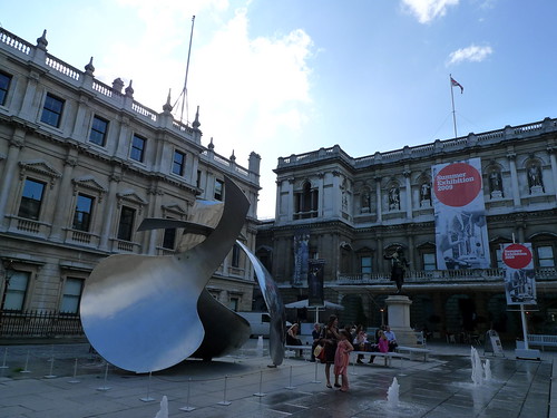 As usual, the summer exhibition in

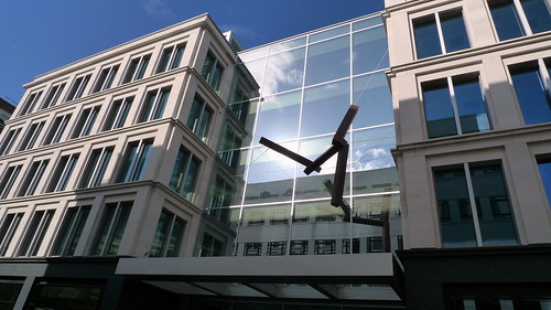 American artist Joel Shapiro was commissioned to produce an installation at the entrance of the office-retail development. His free-floating forms standing out sharply from the monolithic facade of the building. The reflective glass around produce even more drama on these 'flying' tubes.
*****Serpentine Pavilion 2009
