20 creations of red

by Vanessa Champion

Red Never Follows

Saatchi Gallery

31.07-01.09.2013

Blood red light seeps across the ash white canvas that is the second floor of the Saatchi Gallery; on entering the exhibition space you are immediately transported to somewhere that feels at once safe and dangerous, the warmth of the colour is almost womb-like and yet the movement on the walls around you disturbs the equilibrium. There’s a symphony of technology, design and conceptualisation that is playing out around you, and you are aware that innovation and creativity are at the root of each installation.

20 years ago in 1993, Hugo Boss was launched, and this exhibition is a collaboration by the brand with 20 urban creatives. I spoke to Christoph Frank of Platoon, the curators based in Germany, who said that in selecting the work and the creators, the importance was “innovation and creativity.” They actively sought those who were taking a “different approach which is in keeping with the ideology of Hugo Boss.” This originality of imagination truly resonates loud and clear through the exhibition. Also it is clear that there is an inventive resourcefulness of those from different disciplines. Again, like Hugo Boss is wont to do, pushing boundaries of expectation and preconception, the art on show here might not necessarily fall into the usual “fine art” disciplines. We don’t recognise the traditional arts of painting, photography, drawing, no we have visuals and installations by designers, film directors, engineers, architects from all over the world, from Germany to Japan, Portugal to LA and that I think makes the richness of the collection unique and pioneering.

This leads to the question, what makes art ‘art’? Not that long ago, photography was criticised for being an almost mechanistic form of representation, not real “art” and then in walks Ansell Adams who one could argue, might blow away even the most cynical sceptic as he used knowledge, analysis and technology to achieve and manifest his own artistic and creative aims. So too, we have here in this exhibition, individuals who “know” what their respective technology can do and are adopting it to originate representative forms. It’s a really interesting concept for a show, and one which I feel the curators have really pulled off.

Güvenç Özel & his work

Güvenç Özel now residing in LA, but originally from Turkey, an architect and artist has created a ‘cave’ of paper, constructed out of folded triangles forming pentagrams which breathe in response to the signals emitted from a headset worn by the listener. Red light bathes the interior. Güvenç told me that it is a wireless device that maps mind waves. Disturbing maybe, but incredibly thought provoking, as he said, the cave breathes in response to our mind, thus we can make manifest thought patterns and control the space around us.

Luke Taylor and Chris Barrett with their vinyls

Have you ever sat and been mesmerised by the sound “heart-beat” patterns on SoundCloud? No? I suggest you take a look, find a track and listen. That’s just what inspired US (Luke Taylor and Chris Barrett based in Kingston, London) as film directors to create a 3D stop motion of a track by hip-hop musician Wiley. A great dumb-bell like row of old vinyl each cut accurately to size to represent the beats and course of the track. They had to film it in “reverse” they told me. Creating the whole track first with the vinyl then cutting it off in reverse time. The piece here they painstakingly have recreated. I love it that the old vinyl which would have likely ended up in landfill has found a new voice in these guys’ hands.

Julian Adenauer & his work

A flat black robot seems to float effortlessly and somewhat determinedly across one expanse of wall, painting red over and over again, like some gothic medical cat’s cradle. I chatted to Julian Adenauer (one half of Sonice Development, the other half is Michael Haas) who explained the science behind the weird anomaly suctioned to the wall of the gallery. The lightweight plastic of “Big Ben” (their nickname for it) gradually will create a dense colour space as it will move for 200 hours, the longest they have run it. Different colours are used including complementary ones to make, enrich and deepen the tones.

Marco Barotti & his work

A big red plastic dome sits in the centre of the second room, it is see through and has a big circular rubber slit you step through (somewhat ungainly in my case with heeled boots and camera slung over my shoulder) and you clip a little black devise to your ear-lobe. You relax and then the technology which is strapped into the big red dome above you, interprets your heartbeat to create vibrations and sounds around you. It’s weird, after stepping through the ‘slit’ it feels as though you have entered into yourself (no, I’ve not taken anything, ed.). “It’s all about human interaction” said Marco Barotti, of ‘Plastique Fantastique’. He’s Italian living in Berlin. I really enjoyed talking with him, his ideas and vision you can almost feel bouncing off of him. He is fascinated by music and architecture, and it is no wonder as he studied percussion at the Siena Jazz Foundation also. He is interested in different forms of architecture and how you can bring human interplay to change and create the space.

Other installations worthy of note were the wall of videos, Armin Keplinger 1:1000 where what looks like a piece of internal flesh is suspended, spikes poke out slowly and then morph into vertical droplets which slip and gloop audibly down the screen. Bart Hess ‘Mutants’ video was mesmerising as a man trapped inside a rubber suit, pushes and stretches his shiny prison which reflects fluorescent lights that cloak him with a dismembered exo-skeleton.

Eliza Strozyk & her work

Not many women featured, in fact one in her own right, Eliza Strozyk from Germany, triangular wood pieces on fabric, which creates a structural blanket of crimson and red fading to almost peach and natural wood.

Jun Fujiwara's work

The exhibition is clearly a celebration of the Hugo Boss brand, the famous ‘red’ sailing through the whole concept, you can’t help but feel, it is an amazing positive idea for creatives to express themselves on an international platform here at the Saatchi Gallery that is renowned for exploring and freeing the wings of the new and original, and after all isn’t that what design, art and creativity is all about? Collaboration and expression? The arts need patronage and I’m all for wherever that spark comes from. It’s opened up a whole new box of ideas for me, and I’m looking forward to exploring these artists’ works some more.
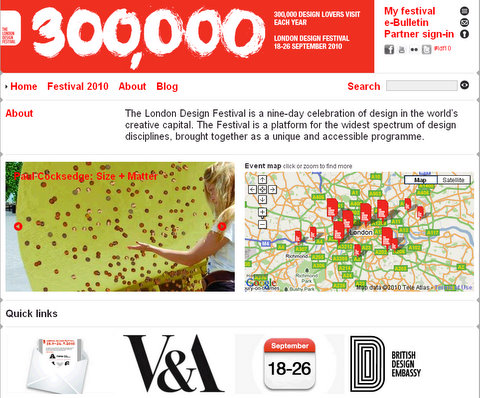
Top picks for London Design Festival 2010

London Design Festival 2010
18-26.09.2010

In a week's time, the annual Design Festival would transform London into a mega design fair with over 200 events happening across the city. Believing in the power of creativity and the artistic value in good design, we have hand-picked 20 favourites (in order from the official print programme) below:

1. The Sphelix Installation by Johnny Hawkes in Covent Garden

"Standing nearly 3 metres high a white half Sphelix is situated next to the new Apple Store. The sculpture number 5 of an edition of 10 is made in GRP. The Sphelix® is a new global shape, the joining of a sphere and a helix, it spins ying yang, DNA and the life force, the joining of communities. Johnny Hawkes has been invited to show his work in many international & national exhibitions. An outsider artist, dropping out of art school, he started his studio in London in 1976 and is the creative and commercial force behind PW Ltd."

2. The AppLounge by Alexander Grünsteidl in 100 Wardour Street

The Applounge Logo

"The Applounge is a collaboration between Digital Wellbeing Labs, Method, App.itize.us and SpotSpotOn. It features a curated selection of well crafted mobile applications and services, sourced from creative agencies around the world, matched with accessories, and  fashion items to fit with different occasions and individual lifestyle requirements. Coffee is served during the day and cocktails at night. Alexander set up Digital Wellbeing Labs together with his partner Priya Prakash in 2005, to bridge the last mile between the producers and consumers of digital products and services."

3. ÖÖ: Was it a Dream? by Keskula in 94 Berwick Street

"ÖÖ, or 'night' in Estonian, is a pop-up gallery + concept store showcasing work by young avant-garde creatives from six Nordic countries - Denmark, Estonia, Finland, Iceland, Norway and Sweden. It is a collaborative project by a community of fashion and product designers, photographers, film makers, artists and illustrators, whose work introduces dark and surreal aspects of Nordic aesthetics.The project is accompanied by event programme featuring musicians, DJs, film screenings and art performances. KESKULA is set up to connect new creative minds from the six countries. The long-term vision for KESKULA network is to set up a foundation to support young designers from Nordic countries and launch creative residencies in London and New York."

4. Outrace - the official festival installation in Trafalgar Square by Clemens Weisshaar & Reed Kram

"This year's spectacular Trafalgar Square installation allows the general public to take control of eight industrial robots on loan from Audi's production line. Visitors to the square, alongside the entire global web audience, will be able to book a slot to interact with the installation via the specially built website."

5. The Smalls Short Film Fest 2010 in 125 Charing Cross Road

"The Smalls launched in September 2006 in association with The London Design Festival and Creative Review. The showcase celebrated “Small Films for Small Screens”, through a display of short films made for the web, iPods and mobile phones.The interest in The Smalls, from industry and contributors, led to the launch of thesmalls.com, an online showcase for the creative community, at the end of 2006. Since then there's been collaboration with a number of broadcast and media partners on other competitions, as well as having launched a monthly short film screening in New York called The Can."

6. Anti Design Festival initiated by Neville Brody 28 Redchurch Street

"The Anti Design Festival will attempt to unlock creative fires and ideas, exploring spaces hitherto deemed out-of-bounds by a purely commercial criteria. Created initially as a direct response to the pretty commerciality of the London Design Festival, the festival will shift the focus from bums-on-seats to brain food, and from taste and style to experiment and risk. At multiple venues around Redchurch Street, the festival will incorporate exhibitions, installations, workshops, performances and talks in Art, Design, Product, Film, Sound, Fashion, Performance, Print and Interactive. Directed by Neville Brody, the world-renowned graphic designer, the festival will be curated by a select group of leading practitioners in various fields. These curators include Daniel Charny, Terry Jones, James Payne, Harry Malt, Stuart Semple and Brody himself. To date, contributors include Stefan Sagmeister, Jonathan Barnbrook, Yugo Nakamura, Yomi Ayeni and Mark Moore, as well as an open-submission route."

7. Emerge - the original graphic design graduate showcase curated by Dominic Lippa in multiple venues across east london

"This year you may well stumble across emerge without even realising. We'll be displaying special commissioned posters designed by a handpicked selection of 2010's graphic design graduates (chosen by Dominic Lippa) in underground stations around East London. To see the whole collection in one place, head along to The Cube London where the prints are available on sale. Besides there is an afternoon of information and advice in 'Bridge' for emergeing graduates on subjects such as setting yourself up as a freelancer, tax, IP and many more issues that may arise for recent graduates."

"Gastrotypographicalassemblage: The Designs of Lou Dorfsman presents the design history of one of the United States' most revered designers. In his forty years spent at the CBS television network, Dorfsman was responsible for every aspect of the advertising and corporate identity. Kemistry Gallery present a life's dedication to design excellence. Appealing to those with an interest in graphic design, advertising and broadcasting, the exhibition also serves to document the identity of the CBS network."

9. Kei Ito's special lighting by Museumaker at the Geffrye Museum

"The commission forms a centre-piece for the front gardens of the Museum, which are being refurbished in 2010. Kei Ito is designing an installation of lighting on either side of the main path. This will be extraordinary and beautiful: an ethereal parade of chairs and lamps, reflecting the Museum’s themes and inspired by the global cultural influences that have shaped English furniture, ornaments and textiles. Larger than life, they will be made from woven fibre optics and, from dusk, their glow will create a sense of ghostly magic on Autumn and Winter afternoons."

"Following on from last year’s success, Norwegian Prototypes returns with 14 Norwegian designers. This year the participants have all been asked to reflect on the size 55 x 40 x 23, a standard hand luggage size when travelling with budget airlines. The exhibition will present different solutions and approaches to this set format. Expect to see innovative approaches and a wide range of products all of which are easily transportable. As a self-initiated exhibition with little funding set up by the two designers, the team works around the limitations of a small budget and the help of all the participants. With the chosen theme it is able to transport the products at a minimum cost from Norway. This also reflects on current topics and issues such as ‘shipping air’, carbon footprint, packaging and the mare price of transport."

11. TENT London in Truman Brewery

"Now in its forth year in the Old Truman Brewery in Brick Lane, Tent London showcases over 200 designers, manufacturers, design collectives and companies from more than 10 countries; presenting the cutting-edge contemporary interiors products and digital installations."

12. The Tramshed initiated by Luis de Oliveira of De la Espada at 32 Rivington Street

"The Tramshed, set to be the premier destination at this year’s London Design Festival, will feature 25 exclusive international design brands at this bold new venue. Initiated by De La Espada’s founding director Luis de Oliveira, and delivered by respected design-event experts Deborah Spencer and Alice Breed, this striking post-industrial venue will showcase the very best in high-end authentic design. 'The Tramshed Live’, curated by design writer and seminar/conference producer Aidan Walker, will run a series of thought-provoking design debates."

13. Skyroom at the Architecture Foundation

"Skyroom is a new rooftop venue for London. Sitting above the Architecture Foundation on Tooley Street, the installation provides a range of spaces for performances, meetings and relaxation. A central courtyard open to the sky frames the towers standing over London Bridge while a balcony cantilevered over the street offers breathtaking views of the Thames and the Tower of London beyond."

14. "Plain Place - John Pawson" in Design Museum

"Plain Space celebrates Pawson’s career from the early 1980s to date and includes a selection of landmark commissions including the Sackler Crossing at the Royal Botanic Gardens, Kew, the new Cistercian Monastery of Our Lady of Novy Dvur in the Czech Republic and Calvin Klein’s iconic flagship store in New York, as well as current and future projects."

15. DROP by Paul Cocksedge at Southbank

"Cocksedge conceived ‘DROP’ as an outsize coin ‘which has fallen to Earth from a giant's palm’. Lightly buckled upon landing improbably upright. The giant coin is magnetic, encouraging passers-by to participate by affixing their spare pennies. At the end of the installation the public contributions will be counted and Barnardo’s corporate partners will turn every penny into one pound."

16. 'Framed' by Stuart Haygarth at the V&A Museum

"‘Framed’ uses off-cut pieces of picture-frame to bring this significant piece of the museum’s architecture to life, and to create a dramatic landscape through which visitors can walk. Creating magical and evocative stories through objects and architectural features is central to Haygarth’s work, and this installation is no exception."

17. 'Kinetic Light' by Michael Anastassiades at the V&A Museum

"Michael Anastassiades has designed a pendulum light for the Norfolk House Music Room at the V&A. Like a silent inverted metronome, the hanging arm of this bespoke installation holds a glass light ball which describes a perpetual rhythm. The mesmeric trajectory evokes a distant age when music sought to recreate the harmony of the spheres, and the interplay between elegance and hospitality was a delicate balance."

18. 100% Design in Earl's Court Exhibition Centre

"100% Design London features world-class interiors show 100% Design, innovative and sustainable architectural products event 100% Detail, cutting-edge materials exhibition 100% Materials and emerging talent showcase 100% Futures. Meet over 350 hand-picked exhibitors selected for their creativity and originality. From furniture to futuristic materials, emerging talent to building products, 100% Design London offers unrivalled bright ideas and visionary solutions for designers, architects, specifiers and buyers."

"This is the first UK solo show of the Japanese design studio Nendo. This two part exhibition features a new series of works that will be on view at the Saatchi Gallery. At the same time, an installation of archival works will be exhibited at Phillips de Pury, Howick Place."

20. Re: Public by University of the Arts London at Chelsea Futurespace

"This exhibition explores the increasing sophistication of public art, and the willingness of gallery artists to work with architects and engineers on permanent public projects. What effect does the move out of the artist's comfort zone, access to new materials and technologies, technical constraints, the change of scale ad the need to adapt and compromise have on both the artist, client and architect? What happens when an artist is commissioned to make a public work away from the privacy of the studio or the relative safe haven of a gallery; how does it affect the creative process and how does it affect the artist’s future work?"

*****

Further Readings -
Official blog
Talking the Tramshed - interview with Luis de Oliverira
Interivew with Paul Cocksedge on his DROP installation

art september in london - part 2

Abstract America
until 17.01.2010
Saatchi Gallery

abstract america at saatchi gallery by you.
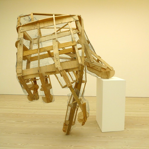
Untitled (Unfinished Hand) (2006) by Peter Coffin

This main exhibition in the gallery shows the talents american artist have. As the show focus on works with a so-called abstract theme, one wonder that isn't most contemporary art creations are 'abstract'?

To be honest, some of the pieces shown are not very impressive. Nonetheless there are some amazing pieces and you would just be stunned when you see in first sight, like the spiral staircase by Peter Coffin. The beauty of the piece comes from the simplicity of the geometry, and the harmonious bending of something you would feel so secure and hard everyday as a metal staircase. That is a universal beauty in its overall form, its materiality and its symbolism all combined.

abstract america at saatchi gallery by you.
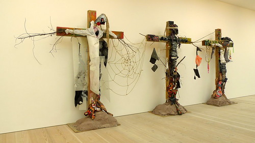
Three (Cross with Balloons) (and 2 details)

abstract america at saatchi gallery by you.
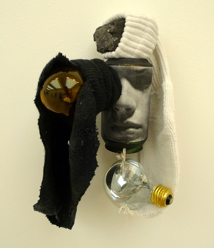
Untitled (Can Sculpture) x3 views (2007) by Paul Lee

abstract america at saatchi gallery by you.
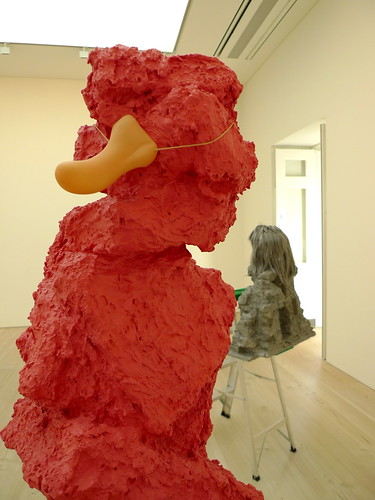
Nose (2005) at the front and Glamour Wig (2005) at the back both by Rachel Harrison

abstract america at saatchi gallery by you.
Untitled (Spiral Staircase) (2007) by Peter Coffin

abstract america at saatchi gallery by you.
Continent (2007) by Jacob Hashimoto

Another of my favourite piece is Nine -


Nine (2007) by Guerra de la Paz

When I walked into the room and saw this tree-like installation, I was not entirely sure what the intention of the artist is. But you would want to approach it. You want to look inside and down under the clothes to explore it. You want to walk around and experience it. It is fun. It is inviting. And I started to let my mind go figure out what exactly this work is about - why there are so many layers of clothes like a crown of a tree covering up the identity of the standing feet? Is that what we do everyday, trying to dress ourselves up in a masquerade that nobody could see our real faces?


Forming (2007) by Patrick Hill

full photo set here

*****

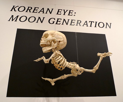
Korean Eye: Moon Generation
until 01.10.2009
Saatchi Gallery

korean eye: moon generation . at saatchi gallery by you.
Homo Animatus (2007) by HyunKoo Lee

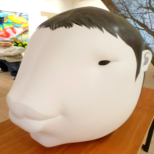
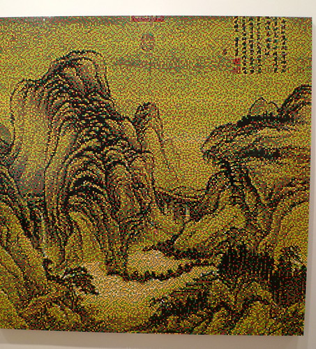
Also showing in the gallery is this show on contemporary Korean art. A fairly obvious common character among many of the works is a sense of humanity, be it the subject or the interpretation. Even some of the works may seems a bit abstract, they are in no way as abstract as the ones in the American show on the other side.

korean eye: moon generation . at saatchi gallery by you.
Shamoralta Shamoratha (2007) by Inbai Kim

korean eye: moon generation . at saatchi gallery by you.
Jangdockdae (2008) by Yi HwanKwon

korean eye: moon generation . at saatchi gallery by you. 
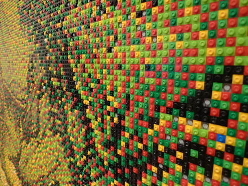
Pla Mountain 09-188 (2009) by Whang Inkie

Close-up:
korean eye: moon generation . at saatchi gallery by you.

full photo set here

Further reading
Official page of Abstract America
Official website of Korean Eye