Art Night London 2019 - how to make it greater next year?

From my Art Night London experience last weekend, I have the following suggestions to the organiser from a user perspective -

Pervilion featuring Sasha Pirogova, Clementine Keith-Roach

1. Pick the right date:

Pride + World Cup quarter-finals happening on the same day mean no one have much energy left for a full night out. That also means no media outlets will have space to publicise or promote the event even it can be a really attractive alternative to some people.

We know World Cup is a bit of an unexpected uprising, but Pride is well known to happen this time of the year and it really should not be that difficult to perhaps contact organisers of pride parade and football outdoor screening venues to see whether some kind of mutual promotions can be made. Some performances could even be brought forward to begin earlier to catch the momentum of the gathered crowds for Pride and England fans.

Lads - live dance, sound and instagram occupy project by Christopher Matthews

2. Create better TV-listing style programme:

The venues this year are very spread-out. There is a nice brochure available from volunteers in key locations with a map and details of individual events but it is too much to read. The so-called official app or digital listing is embedded with the Visit London website/app which is not solely for this event. That adds to confusion to show clearly what's happening when and where. Everything happens so quickly in a few hours and most events or performances do not happen all night long. Not many people realise that until they find that they have missed the chance to catch the things they want to see, or arrive too early and have to wait for the event to start.

It could work so much better if there is a summary table at the back of the paper programme which shows every event in a time-scale like a TV listing. They can be grouped either by the key districts or by event categories, or even both if you produce 2 separate tables. People can then plan their routes easily according to the available hours they have and then look up for further details of the events after consulting the time-scale table. The table can also be made interactive online so by clicking on the event listed one can be diverted to the details and have the opportunity of marking it on google maps or so.

Life Track by Vajiko Chachkhiani 

3. Think Across the Spectrum

The event can become a big annual draw as the equivalent of something between Notting Hill Carnival or Frieze Art Fair which blends static installations with video works and live performances.

It can also be a great mascot of London's push for the 24/7 night time agenda. We should seize this opportunity to consider what collaboration possibilities can be made with different sectors and create more creative opporunities in future.

In most occasions, the 'exhibition' component of the participating galleries are closed before 10pm even the overall Art Night is advertised to continue throughout the night till 6am. Most events happening beyond midnight are after parties with musicians/artists. If it wants to be truly diverse and multi-faceted, why we cannot have both exhibitions and parties open the whole night long?

Is there a possibility for cross-time-zone cross-platform co-creation? Live stream something from other parts of the world where people are still awaken in day time, so that becomes part of the events happening in London at the same time? Can this become something like a global art night marathon of a few different cities hosting it around the clock?

London is always famous for its edge and imagination - we should really take this forward and make Art Night a global event!

interview with Eddy Kamuanga Ilunga

written by Trevor To

Eddy Kamuanga Ilunga's second solo exhibition with October Gallery opened this month. Titled 'Fragile Responsibility', the theme of the exhibition is the transition between "tradition and modern, colonial and indigenous" cultures in the life of Congolese society. 

His use of vibrant colours on the subjects in the foreground, together with subtle symbols in the underlying patterns on the skin of the characters in the paintings and the monolithic background, create a visual tension for the viewers to explore the canvas.

The surrealist nature of the paintings is also depicted through the gesture of the characters in the paintings. With their non-photogenic eyes and lack of direct eye contact with the viewers, they look more like ancient stone carving than contemporary people. They resemble more to static statues frozen in time or an Congolese version of terra-cotta army turning up in today's street scenes by mistake of the time tunnel. 

We have interviewed the artist during his visit in London for the exhibition, to share his creative insight with our followers:

*****

Q1: Your paintings often feature human figures in an abstract background. What is the thinking behind this?

EKII work much on human figures as they are the foundation of humanity. I draw upon my personal experiences and I try to question reality through these figures. The abstract background represents a grey, hazy past – a history that we are not able to grasp nor understand due to the fact it was written in an insincere way.


Q2: How do you decide what symbols you select to be featured in your paintings?

EKII approach these signs, these ideographs, as a pre-colonial savoir-faire, which has existed for centuries. Today, these symbols do not exist as the society they are from was eradicated by colonialism. They were once used in politics, justice, religion, however, today they have been erased from the memory of the Congo.


Q3: Your art practice seems to focus in paintings. Do you have any interest in other media? Will you consider to explore other media (e.g. sculpture, digital etc.) in the near future?

EKII have a strong relationship with painting. For me there is a sort of life in paintings; when I see them in museums I see a life after beyond the artist’s signature. Paintings transform over time. In twenty years, I will look at my works and they will probably be different. I am also interested in other media, for example during my researches I took pictures and made films that I have never exhibited. This summer I am going to present in Austria a series of photographs of the Mangbetu people.


Q4: Could you share some insight about your international exposure - are there any first-hand inspirations or observations in person over the past few years that has some profound impact to you?

EKIThere is a particular moment that inspired me: the first time I saw a vitrine full of objects from our colonial past in the Royal Museum for Central Africa at Tervuren. It raised a lot of questions for me. This was about two years ago.


******

Further Readings -
Official instagram of the artist
Understanding the present through the past, Financial Times 11.05.2018 - link

(Images are part of the artist's paintings. All art work courtesy of the artist and October Gallery)

20 creations of red

by Vanessa Champion

Red Never Follows

Saatchi Gallery

31.07-01.09.2013

Blood red light seeps across the ash white canvas that is the second floor of the Saatchi Gallery; on entering the exhibition space you are immediately transported to somewhere that feels at once safe and dangerous, the warmth of the colour is almost womb-like and yet the movement on the walls around you disturbs the equilibrium. There’s a symphony of technology, design and conceptualisation that is playing out around you, and you are aware that innovation and creativity are at the root of each installation.

20 years ago in 1993, Hugo Boss was launched, and this exhibition is a collaboration by the brand with 20 urban creatives. I spoke to Christoph Frank of Platoon, the curators based in Germany, who said that in selecting the work and the creators, the importance was “innovation and creativity.” They actively sought those who were taking a “different approach which is in keeping with the ideology of Hugo Boss.” This originality of imagination truly resonates loud and clear through the exhibition. Also it is clear that there is an inventive resourcefulness of those from different disciplines. Again, like Hugo Boss is wont to do, pushing boundaries of expectation and preconception, the art on show here might not necessarily fall into the usual “fine art” disciplines. We don’t recognise the traditional arts of painting, photography, drawing, no we have visuals and installations by designers, film directors, engineers, architects from all over the world, from Germany to Japan, Portugal to LA and that I think makes the richness of the collection unique and pioneering.

This leads to the question, what makes art ‘art’? Not that long ago, photography was criticised for being an almost mechanistic form of representation, not real “art” and then in walks Ansell Adams who one could argue, might blow away even the most cynical sceptic as he used knowledge, analysis and technology to achieve and manifest his own artistic and creative aims. So too, we have here in this exhibition, individuals who “know” what their respective technology can do and are adopting it to originate representative forms. It’s a really interesting concept for a show, and one which I feel the curators have really pulled off.

Güvenç Özel & his work

Güvenç Özel now residing in LA, but originally from Turkey, an architect and artist has created a ‘cave’ of paper, constructed out of folded triangles forming pentagrams which breathe in response to the signals emitted from a headset worn by the listener. Red light bathes the interior. Güvenç told me that it is a wireless device that maps mind waves. Disturbing maybe, but incredibly thought provoking, as he said, the cave breathes in response to our mind, thus we can make manifest thought patterns and control the space around us.

Luke Taylor and Chris Barrett with their vinyls

Have you ever sat and been mesmerised by the sound “heart-beat” patterns on SoundCloud? No? I suggest you take a look, find a track and listen. That’s just what inspired US (Luke Taylor and Chris Barrett based in Kingston, London) as film directors to create a 3D stop motion of a track by hip-hop musician Wiley. A great dumb-bell like row of old vinyl each cut accurately to size to represent the beats and course of the track. They had to film it in “reverse” they told me. Creating the whole track first with the vinyl then cutting it off in reverse time. The piece here they painstakingly have recreated. I love it that the old vinyl which would have likely ended up in landfill has found a new voice in these guys’ hands.

Julian Adenauer & his work

A flat black robot seems to float effortlessly and somewhat determinedly across one expanse of wall, painting red over and over again, like some gothic medical cat’s cradle. I chatted to Julian Adenauer (one half of Sonice Development, the other half is Michael Haas) who explained the science behind the weird anomaly suctioned to the wall of the gallery. The lightweight plastic of “Big Ben” (their nickname for it) gradually will create a dense colour space as it will move for 200 hours, the longest they have run it. Different colours are used including complementary ones to make, enrich and deepen the tones.

Marco Barotti & his work

A big red plastic dome sits in the centre of the second room, it is see through and has a big circular rubber slit you step through (somewhat ungainly in my case with heeled boots and camera slung over my shoulder) and you clip a little black devise to your ear-lobe. You relax and then the technology which is strapped into the big red dome above you, interprets your heartbeat to create vibrations and sounds around you. It’s weird, after stepping through the ‘slit’ it feels as though you have entered into yourself (no, I’ve not taken anything, ed.). “It’s all about human interaction” said Marco Barotti, of ‘Plastique Fantastique’. He’s Italian living in Berlin. I really enjoyed talking with him, his ideas and vision you can almost feel bouncing off of him. He is fascinated by music and architecture, and it is no wonder as he studied percussion at the Siena Jazz Foundation also. He is interested in different forms of architecture and how you can bring human interplay to change and create the space.

Other installations worthy of note were the wall of videos, Armin Keplinger 1:1000 where what looks like a piece of internal flesh is suspended, spikes poke out slowly and then morph into vertical droplets which slip and gloop audibly down the screen. Bart Hess ‘Mutants’ video was mesmerising as a man trapped inside a rubber suit, pushes and stretches his shiny prison which reflects fluorescent lights that cloak him with a dismembered exo-skeleton.

Eliza Strozyk & her work

Not many women featured, in fact one in her own right, Eliza Strozyk from Germany, triangular wood pieces on fabric, which creates a structural blanket of crimson and red fading to almost peach and natural wood.

Jun Fujiwara's work

The exhibition is clearly a celebration of the Hugo Boss brand, the famous ‘red’ sailing through the whole concept, you can’t help but feel, it is an amazing positive idea for creatives to express themselves on an international platform here at the Saatchi Gallery that is renowned for exploring and freeing the wings of the new and original, and after all isn’t that what design, art and creativity is all about? Collaboration and expression? The arts need patronage and I’m all for wherever that spark comes from. It’s opened up a whole new box of ideas for me, and I’m looking forward to exploring these artists’ works some more.

mayfair art walk - april 2013

The mayfair art scene has gone minimal and zen last month with the following shows in the neighbourhood.

Bischoff/Weiss gallery


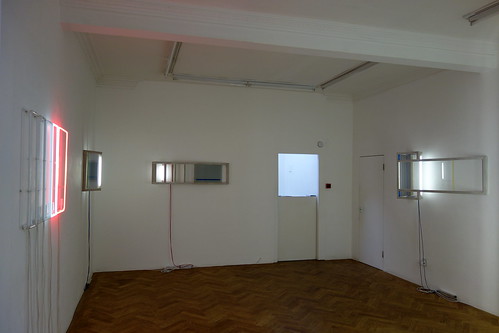
Londoner Nathaniel Rackowe was showing in this simple space on Hay Hill (off Dover Street). The gallery walls are plain white and the floor are laid with zig-zag wooden tiles. It feels like an unoccupied studio/loft space.


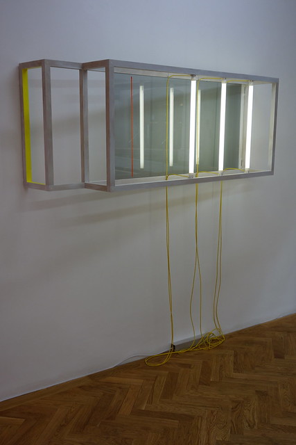
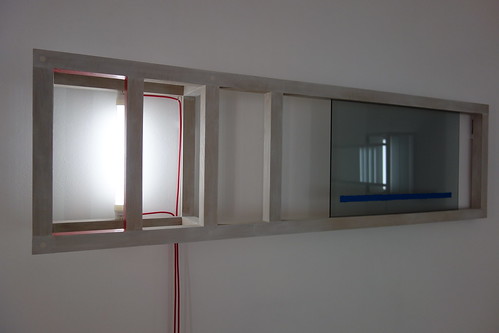
Nathaniel's works have created an interesting tension with the gallery space. The sterile cold cathode lights juxtapose with colour neons. Mirrors and sheets of glass form new shadow dimensions within the exhibition space, amplifying the presence of passing-by visitors. These reflections connect individual pieces around together to become an integral piece as a whole, with the visitor's movements injecting a temporary dynamic component to it.


Full photo set here

28.03-05.06.2013
Gazelli Art House


Over Dover Street, we saw Italian artist Aron Demetz & Korean artist Shan Hur in a joint show. The connection between the works of the two artists are not obvious, in fact it is almost non-existent.


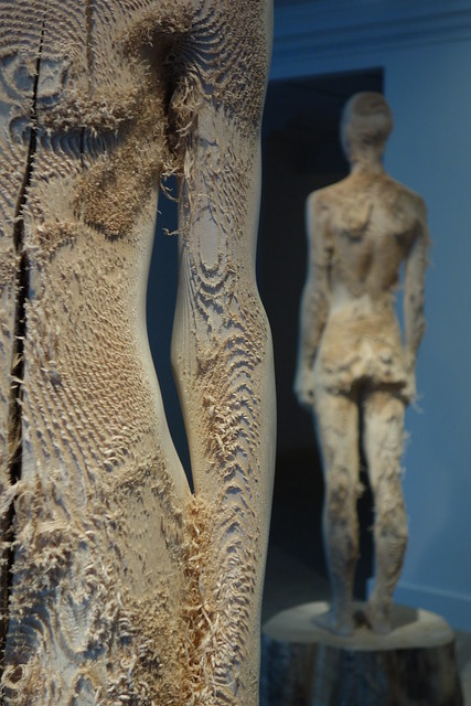
Aron's raw wooden figures are fascinating in the way they tries to represent life in two dimensions - that they are made of timber which was alive in the past and its form are human. He even has fake mushrooms growing from some of the figures, pretending life is thriving again on these dead logs.

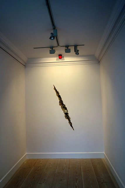
this crack is a small-scale replica or Doris Salcedo's giant crack in Tate Modern Turbine Hall? 

Shan's works on the contrary are more site-specific and look like a parody of the gallery experience. As part of the gallery's Window Project, he duplicated the gallery entrance's columns right behind the entrance doors and twisted one of them as one of the show pieces.

Full photo set here

*****

Further Readings
Page: official press release for the Tainted show
Page: Garden fence uprising designed by Nathaniel Rackowe; by Manijeh Verghese for Iconeye.com

london art/brunch episode 1

the Riding House Cafe x Mark Wallinger's the Underground at Anthony Reynolds Gallery
13.04.2013

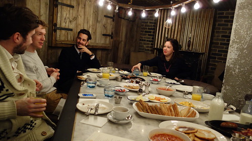
Our first ever London Art/Brunch collaboration with the Breakfast Boys London was held a couple weeks ago. Organised in less than a month, it was a bit rush but we took the challenge & made it.

Our wonderful breakfast was hold in the private dining room of the Riding House Cafe.

The @Breakfast_Boys and our guests Creative Consultant @matthewzorpas from thegentlemanblogger.com & Co-founder @katsi111 of exclam.fi 


Artist / History teacher @cmjones85 & Independent champagne merchant @ChampagneEdward


After our sumptuous breakfast and great conversation on a constellation of topics, we got over to Anthony Reynolds Gallery for Mark Wallinger's show 'The Underground'.  


Mark's show is a display of some pieces in his recent city-wide installation with Art on the Underground in an unprecedented scale. It features a labyrinth-like print mounted on the wall of every underground station. This is an exhibition which is truly London and hence the reason we picked it for our debut art brunch.

Video by Jared Schiller - more about the making of this film here

Visit our facebook page album for more images of the day.

We thank every guest joining us for the day and hope they all had a good time. For those who can't make it to our art brunch, don't worry - we would organise the next one very soon! Keep an eye on our twitter and follow both @londonart & @breakfast_boys to make sure you could join next time!