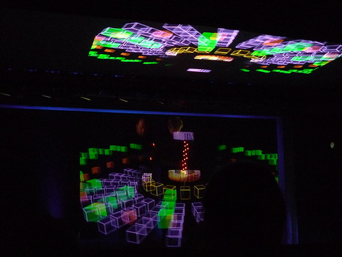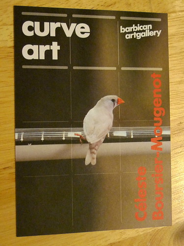
if any zoo invites these little creatures over... it'll be flooded with visitors

Céleste Boursier-Mougenot: New commission for The Curve
till 23.05.2010
the Curve at Barbican Centre

When I first saw the youtube clip below posted by Barbican Centre on its twitter, I have already foreseen this act by human-and-nature would be a huge success. Judging from the long queue I witnessed every time I visited the Barbican Centre in the past few weeks, I can only take the courage to visit on a weekday afternoon when the crowd after office hours and the family over the weekend are largely absent.

Once you are inside the gallery, you would understand why the queue is so long outside. Since there are only some 20-30 birds inside, the gallery has limited visitor figure to 25 at any time only. And nobody would want to just have a glimpse and walk away, as the birds are too cute and have endless variety on their movements you would keep on staring at them once you get there.

The birds are not afraid of men. They would jump onto your shoes, your handbags, and even somebody's head (that boy's hair is a bit fluffy like a bird's nest LOL). They also have a very eye-catching yet harmonious colour palette on their bodies, while the musical instruments selected by the artists are mostly black and white in colour to make a sharp contrast (except the golden metallic cymbals). They fool around freely in the venue as if kids having fun in the school playground.

Judging from the enthusiastic response of the public, I do hope that a zoo would invite the artist to collaborate and transplant this wonderful idea to a permanent display.

Further Readings -
Official page in Barbican website
Artist of the week #78Céleste Boursier-Mougenot by Skye Sherwin at the Guardian (with audio clips)
Introduction of the artist from Frenchculture.org
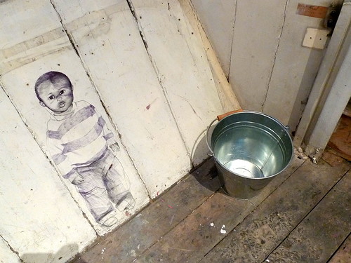
the anxiety of bringing in a new life to the world and the struggle of bringing up a new life
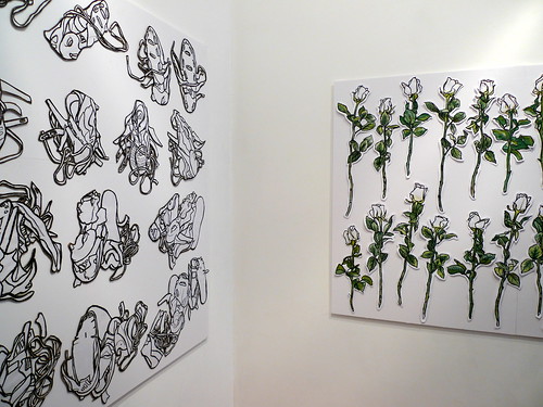
Smother, by Sarah Cole & Coram Young Parents
101 King's Cross Road
till 05.06.2010

As part of the Reveal King's Cross programme, Smother is "a glimpse of a world where young parents navigate their own adulthood amidst the complexities of raising a child." according to the introduction by Art Angel.

The performance is developed by artist Sarah Cole with composer Jules Maxwell and the young parents at Coram through a series of workshop that lasts 9 months. Although they take an abstract approach, it nevertheless delivers a sense of anxiety on the hardship these teen parents face in the real world.

(Below is description about the performance so if you plan to go see it and do not want to be informed, please stop reading now.)

The choice of venue is quite unique - the block is 3-storey high with a basement, and the footprint is so tiny one wonder how proper furniture such as a double bed could be fit in at all excerpt in the basement. The tight space successfully portrays the difficult living environment most young parents are situated.

There are 3 actresses throughout the preview performance we attended. They do not actually interact with each other. Instead they appear alone in the various scenes, reinforcing the loneliness and helplessness these parents experience in the parenthood if they cannot obtain proper advice from family or support organisations.

These are highlights of the scenes in the performance -

video link

video link

video link

The organiser has managed to bring the audience's attention to a social problem using performing arts as the medium. It would be more beneficial to the young parents that they wish to help if there are leaflets or flyers handing out to the audience after the performance, so they can find out more about the services available or any volunteering work they can take part in.

Full photo set here

Further Readings -

Listing of the performance in Time Out London
Official page in Art Angel
Official page of Sarah Cole
Official page of Coram
Official website of Reveal King's Cross

a multi-sensory minimal experience

Cerith Wyn Evans: ''Everyone's gone to the movies, now we're alone at last...''
White Cube Gallery (Mason's Yard)
till 22.05.2010

S=U=P=E=R=S=T=R=U=C=T=U=R=E ('Trace me back to some loud, shallow, chill, underlying motive’s overspill…')

The first thing that comes to my eye while I saw the exhibit above and learnt about this show from the Evening Standard (review link in Further Reading section below) was Pet Shop Boy's music video for their single Minimal. The second thought is why the title - ''Everyone's gone to the movies, now we're alone at last...''. Then from the official press release, I realised its title is from a song by Steely Dan, "Everyone's gone to the movies" in 1975. That's a reincarnation 35 years later, um...

The review from Evening Standard rated it 4 stars out of 5. So I have put the show in my to-do list before I forget about it totally and miss it at the end. And I'm glad that I have gone see it myself - it is a well-presented, powerful show with site-specific works that you would remember both the gallery and the artist altogether after your visit.

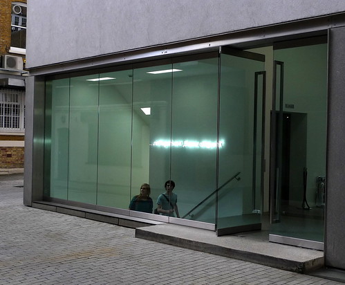
When you approach the gallery, there's a line of text made by neon tube next to the stairs -

Subtitle (2010)

But it is not meant to be viewed from this direction. Instead, it is to be viewed from within through the reflection via the glass -

Subtitle (2010)

The line of text move with your frame of view as you walk, and because of the frame of the gallery glazing it does look like a line of subtitle in the big screen with the view outside becoming the movie itself. The text of this piece also develops a remote link of helplessness to the title of the show - ''Everyone's gone to the movies, now we're alone at last...''

In the main exhibition space on ground level hung the key piece of the show: C=O=N=S=T=E=L=L=A=T=I=O=N (I call your image to mind). This is a fascinating collaboration of acoustic art and science. With a series of hanging mirror discs resembling the Calder's mobiles, strategically positioned loudspeakers and selected soundtracks, a spectacle is created with an atmosphere of sterile lab setting (helped by the white and silver palette). You constantly see yourself in the mirrors but your ears are receiving sound waves reflecting from the walls & mirrors projecting another dimension of flux on top of the visual illusion. It forms a multi-sensory maze which you have to be present inside the space in order to feel the work itself.

At the basement, there is a series of framed prints playing with the concept of positives and negatives with slots cutted on printed page of a poem. But another main piece is forcing you to accept its existence next door - because of the heat it generates and radiates across the space from the moment you reach the bottom of the staircase leading down from the ground level.

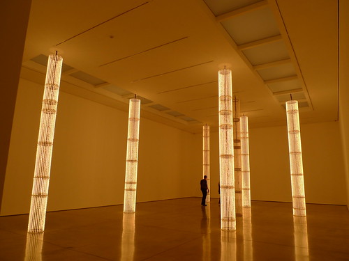
S=U=P=E=R=S=T=R=U=C=T=U=R=E ('Trace me back to some loud, shallow, chill, underlying motive’s overspill…') - video link

The gallery's press release cites this piece has referenced the former electricity sub-station which once stood on the site of the gallery. Whether that is clear or just a mere marketing gimmick phrase should be decided by the audience. I do think that it is relevant, with the gradual 'on-and-off' of the filaments in the "light columns" mimicing the movement of machinery in routine operations. The alignment of these 'light columns' are inspired by the order of stones in japanese zen gardens and stars in the galaxy, and gives a sense of serene beauty to the cubic space.

This is the first time I came across Cerith's works. I found a sense of connectivity of his works with another artist White Cube represents - Kris Martin. While 'time' is very much an explicit essence in Kris's works and he tries to convey the notion of time to the audience through his works; Cerith's works evoke the audience to acknowledge hidden dimensions in space with his operation in time. You couldn't determine the moment which sound emits from the speakers in C=O=N=S=T=E=L=L=A=T=I=O=N (I call your image to mind), it only reaches you after reflections from the wall and the mobile discs. That distortion in reception suggests an added dimension in space created by the artist to the original space as perceived by the audience. And in S=U=P=E=R=S=T=R=U=C=T=U=R=E ('Trace me back to some loud, shallow, chill, underlying motive’s overspill…'), the proliferation of heat radiating out from the works did cause me to think of the strong invisible electro-magnetic fields present in electricity sub-station, although that is not consciously realised by people in most cases. In that aspect, it has materialised something virtual in my eyes.

And that, has made the show worth visiting.

Further Readings -
Trip the light fantastic with Cerith Wyn Evans, review by Ben Luke for Evening Standard 19.04.2010
Review by Charles Darwent for the Independent 18.04.2010
Quote from Michael Archer on Cerith Wyn Evans on Parkett Issue #87
Art work created by Cerith Wyn Evans for Parkett
Official page of the show from White Cube Gallery

the streets are the playground...

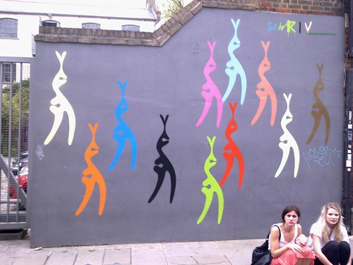
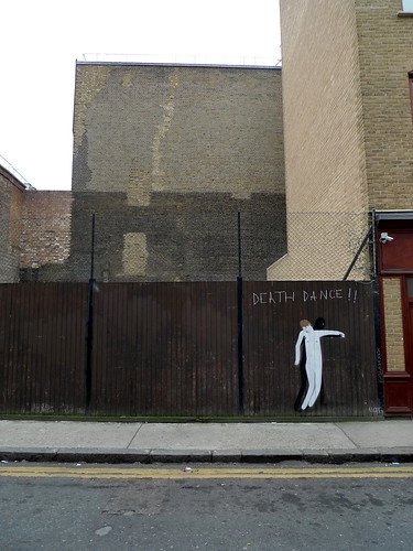
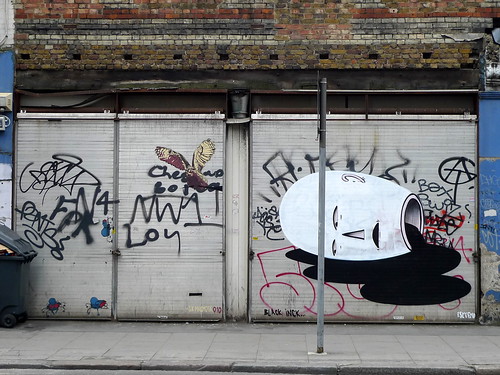
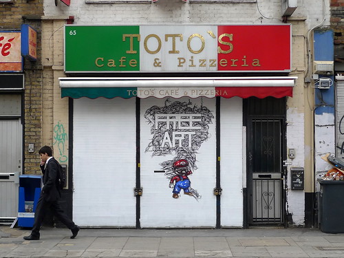
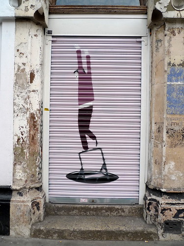
A little walk across these 2 little streets in the east has kept my eyes happy for the rest of the day. I believe there are more talents than just banksy London can offer :)

Would be interested to know more about the creators of these great works. I saw a few by probably the same people elsewhere in town... Just  not having the time to look up online to uncover him/her yet.

On Fashion Street -

On Commercial Street -

the man who makes amazing sculptures like twisters frozen in time

Tony Cragg

Lisson Gallery
till 17.04.2010
 

Tony Cragg's first solo show was held by the same gallery where his latest solo show is opened, but that was over 30 years ago back in 1979.
 
Turning 61 this year, his sculptures clearly show no sign of slowing down with their dynamic forms. Born in Liverpool, he may have inherit some sort of Beatles vibe in his blood that makes all these swinging form so alive even they are made by the most solid materials you could use for art: Timber, Steel, Marble, Bronze... and reading from the list provided by the gallery, each of them weighs from 100kg (the lightest one is made by Fiberglass) to 3200 kg(!)
 
As the title of this review said, these sculptures are so dynamic they are like twisters captured in a snap shot. You can sense the movement and momentum of the components when you walk around each piece -
 
Works displayed in the Ground Floor Main Gallery (video link)
 
Works displayed in the Courtyard (video link)
 
Interview of Tony Cragg by ArtLyst1
 
Signature & Factory stamp on WT (Inverted Columns stainless), 2009

Full photo set here

The pieces all look so unstable, uncertain - yet poetic, beautiful. Tony captures the Zeitgeist of our times in preserved it in eternity in his wonderful works. Catch the show before it closes in the coming weekend. 

*****
 
Further readings -
Tony Cragg's personal page at Lisson Gallery
Tony Cragg's personal page at the Royal Academy of Arts
Review by Richard Cork for Financial Times, 23.03.2010
Sculptor Tony Cragg at the Lisson Gallery - video by the Telegraph's Culture Video

art february in london - part 3

One Place - Chiharu Shiota 塩田千春

19.02-27.03.2010


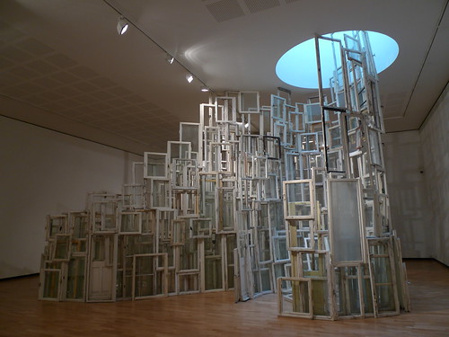
One Place (2010)

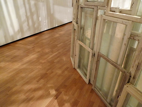
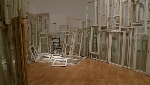
This is Chiharu Shiota's first solo show in the UK. The masterpiece of the show is definitely the title piece of the show, One Place (as shown above). Made from over 400 found windows from East Berlin where the artist lives and works, the fenestrations are collected over the years from deserted and dismantled buildings, construction sites, disused psychiatric hospitals and uninhabited apartments. 

One Place (2010)

One Place (2010)

One Place does not have her usual signature 'spider-web' element physically like the other pieces in the show. But instead the windows themselves are woven into each other like a web and form the spiral spaces within them horizontally, as well as progressively climbing up towards the skylight to introduce a sense of motion/break-through amid its stationary nature.

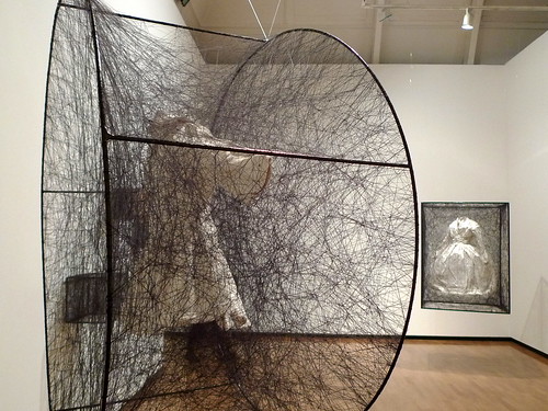
Trauma / Alltag (Dress) (behind - 2009)
Her monochromatic palette of black and white is a powerful twist to the supposingly tender gesture of threads wrapping around objects. This could be an influence of living in a relatively brutal city (Berlin) during her career compared to her home town (Osaka). This eclectic mix of poetry (within the softness of individual strings and floating objects) and tension (the pulling threads as well as the fragility of the works) is what makes the audience fascinated.

Full photo set here

*****

The Astronomy of the Subway by Jitish Kallat
Haunch of Venison
15.02-27.03.2010

Anger at the Speed of Fright (2010)

On the other side of the gallery shows the works of Indian artist Jitish Kallat. As the introduction in the gallery website, Jitish's pieces on display show "his interest in the bustling metropolis lies the experience of the individual within the crowd. " The works are varied in media as well, ranging from video, sculptural installation to photography and his well-known large format paintings.

The Cry of the Gland (2009)

Untitled (2009)

Jitish's works are also currently on display in Saatchi Gallery's exhibition - "The Empire Strikes Back - India Art Today". Below is a clip from the Economist's Youtube channel of the artist speaking about his perspective on modern Indian Art -

Youtube link

*****

Deutsche Börse Photography Prize 2010
12.02-17.04.2010

Donovan Wylie at the introduction video for each shortlisted photographers

Every year, the Photographers' Gallery would shortlist 4 photographers for the Deutsche Börse Photography Prize. This year, Anna Fox (british), Zoe Leonard (american), Sophie Ristelhueber (french) & Donovan Wylie (british) are selected with their respective exhibition series.

Donovan Wylie

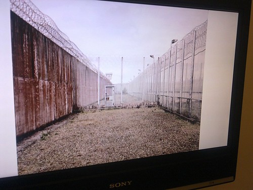
The favourite from @londonart would be Donovan Wylie's documentary-style works of the Maze Prison in Belfast, which was symbol for the conflict between loyalists and nationalists. Donovan managed to capture its architecture in the absence of any inhabitants before its demolition. The emptiness of these images invoke deep thoughts about the life of those who had lived inside before.

Donovan Wylie's work of the prison in Belfast, Northern Ireland

*****

Further Readings -
Official website of Chiharu Shiota
Walking in my Mind - Group show in the Hayward Gallery featuring Chiharu Shiota
Artist of the week 76: Chiharu Shiota by Skye Sherwin for the Guardian, 24.02.2010
Entry of Jitish Kallat in wikipedia
Official page for the Deutsche Börse Photography Prize 2010 at the Photographers' Gallery website
BBC's online album for the Deutsche Börse Photography Prize 2010

art february in london . part 2

Crash
Gagosian Gallery
11.02 - 01.04.2010

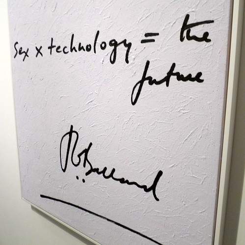
The Future by Lory Greaud

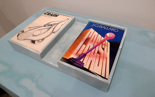
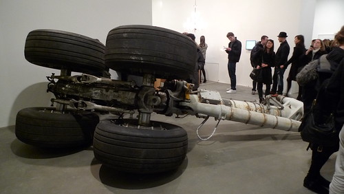
Gagosian usually hosts shows with a few mega-pieces, such as Cy Twombly's roses or Richard Serra's hefty sheet metals. This time they decided to throw a buffet - about 80 pieces by various artists including many big names are shown with the theme of J G Ballard's writing.

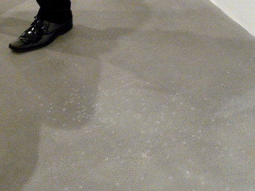
Untitled (2007) by Roger Hiorns, some 235 contact lenses scattered at the floor

Honda Teen Facial (2010) by Adam McEwen

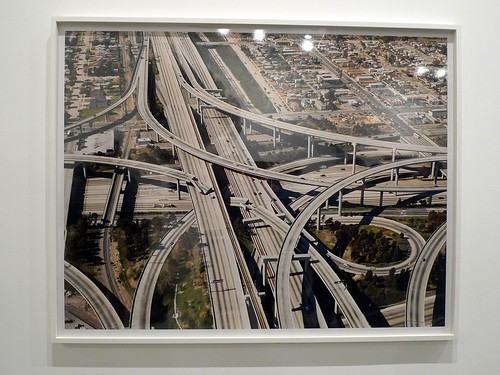
Untitled (Freeway Crash) (2002) by Florian Maier-Aichen

Proton, Unity, Energy, Blizzard (2000) by Jane & Louise Wilson (video link)

Full photo set link

*****
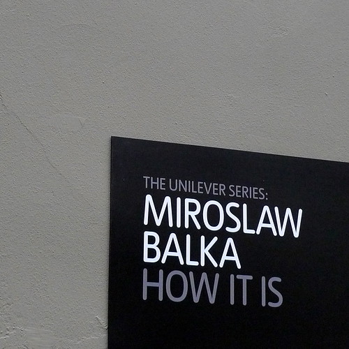
How It Is by Miroslaw Balka
Tate Modern Turbine Hall
13.10.2009 - 05.04.2010

Polish artist Miroslaw Balka's How It Is is the latest turbine hall centrepiece in Tate Modern. It is part of the Polska Year program which showcases polish culture to the british audience. Another Polish artist, Robert Kusmirowski, has transformed the Curve Gallery in the Barbican Centre into a World War II replica bunker last year in his solo show there.

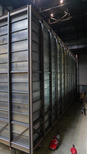
The overwhelming structure occupy almost the entire Turbine Hall

The other end of the installation

The reason I mentioned Kusmirowski is that both artists seem to be using a dark and psychologically heavy palette in their choice of materials and settings on their installations to bring the audience to an isolated pocket in space & time.

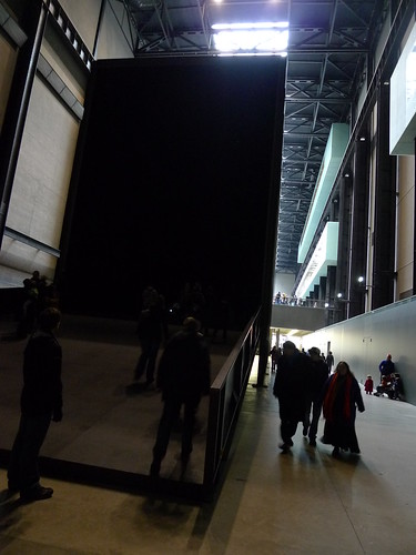
In Balka's giant box, the sense of emptyness engulfs the audience once you stepped into the structure and walk gradually inside. The complete darkness revokes fear and uncertainy. Yet its very presence inside one of the world most-visited museums made its existence surreal and the experience less-confrontational than the artist probably expected. On the contrary, Kusmirowski's installation in the Curve attracts much fewer foot-traffic than Tate Modern, and thus can provide a closer-to-intent experience of the horrifying silence and desertion of a WWII bunker to the visitors.

Full photo set link

Full photo set of Robert Kusmirowski at Barbican Curve link

*****
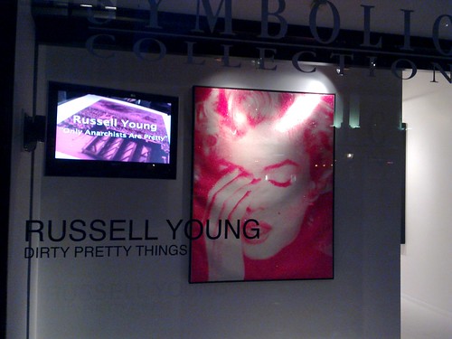
Dirty Pretty Things - Russell Young
04.02 - 13.03.2010

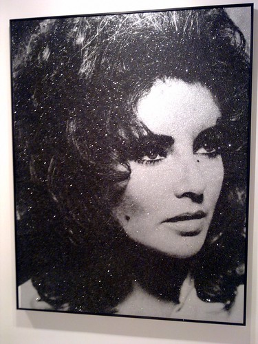
Pop idols are very often borrowed without thanks in postmodern art. Russell Young has lived up to this celebrity culture with his series called Dirty Pretty Things currently exhibiting in the Scream Gallery.

Featuring Kurt Cobain

Featuring Elizabeth Taylor

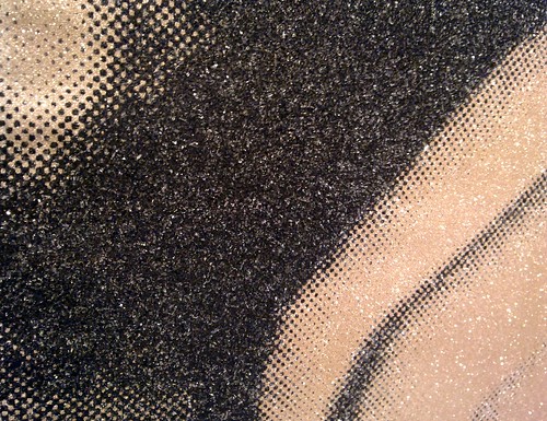
Close-up of the sparkling 'diamond dust' applied on every painting

The sparkles and larger-than-life size portrait may satisfy the avid fans. But could you see what the artist want to tell you through the spectacle? Are there something truly inspirational coming from the people in the paintings?

*****
Further Readings - 
Review on Crash at Gagosian by Martin Gayford on bloomberg.com 
Review on Crash by art-pie
Official page for Crash at Gagosian online
Entry for J G Ballard in wikipedia
Official page for How It Is at Tate Modern online (with video clip)
Artist's statement for Dirty Pretty Things at Russell Young's website

art february in london - part 1

E2 Art Walk
13.02.2010
Havn't visited Vyner Street for quite a while (previous post here), so when a few friends are visiting London this month, I stole the chance to re-visit it again.
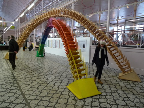
The Chair Arch at V&A Museum of Childhood

Chair Arch (close-up)

We approached V&A Museum of Childhood on Cambridge Heath Road first after getting off at Bethnal Green Station. I decided to go in as I reckoned my friends would be interested to see the vintage toys. To our surprise, we found the chair arch which was previously exhibited at the V&A Museum in Kensington at the central space there! We also saw a great photography show at the entrance space called Wendy's World by london-based french artist Etienne Clément (check the Further Readings section below about the concept and a full view fo the works) - 


Parade by Etienne Clément

Continuing the walk up Cambridge Heath Road, we dropped by briefly at IMT gallery and 242 gallery -


Naoko Takahashi at IMT gallery


On Vyner Street we first stepped into 12A Gallery and found wonderful sculptures by Paul Munn -

Paul Munn at 12A Gallery 

Kate MacGarry is showing Josh Blackwell's miniature paper sweaters -

Josh Blackwell at Kate Macgarry

At Ibid Porjects there're some less-interesting installations of Magali Reus but the short film somehow makes it up. (Note: I previously posted an excerpt of the film here but the person who shot it has contacted me and told me that it is up for commercial sale and I should take it offline. So you won't be seeing it now.)

Background by Magali Reus at Ibid Projects

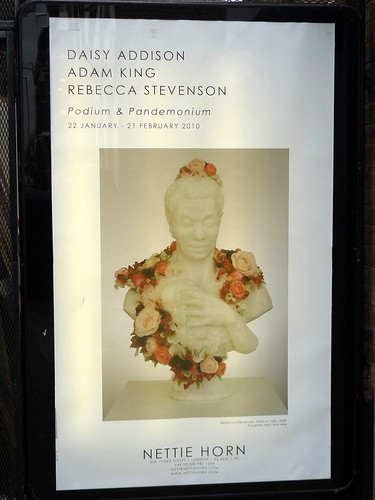
Nettie Horn has a compilation show with 3 artists, and we found Rebecca Stevenson to be the one that impressed us the most among them -

Show poster featuring Folie a l'orange (2009) by Rebecca Stevenson at Nettie Horn

Luxe Vert (2008) by Rebecca Stevenson at Nettie Horn

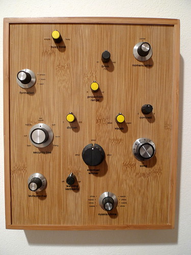
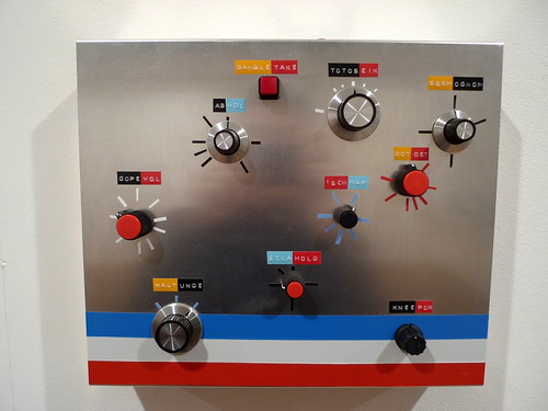
At the Gooden Gallery, Simon Morse's pseudo-mechanical switch boxes are lining up the walls of the gallery space. The mix of low-tech knobs and punch line text scattered on the face of the boxes creates a sense of strange-ness in the familiar -

Wilkinson Gallery has the most amazing work we have seen in the whole afternoon by london-based norwegian artist A K Dolven. The show is minimal yet powerful, characteristic of scandinavian aesthetics - 

Ahead (2008) by A K Dolven

The day the sky become my ground by A K Dolven at Wilkson Gallery (video link)

Full photo set here

Further Readings -
An interactive map of galleries in Vyner Street by the Guardian, 29.09.2009
Official website of Simon Morse
Official website of Paul Doeman
Official page of Wendy's World on Etienne Clément's website with full screen viewing of the series
Official website of A K Dolven

london art fair / kinetica art fair 2010 - part 2

The London Art Fair (LAF, review part 1 here) & Kinetica Art Fair 2010 (KFA,review part 1 here) were hold within a month, and their close proximity in time allow for some observations I would like to share here.

 From the approach to the venue, I found that LAF has done quite a bit of propaganda around the venue -

The projection screen outside the Business Design Centre facing Upper Street would feature art after dark

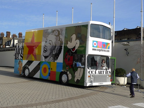
Outdoor bus gallery from CCA

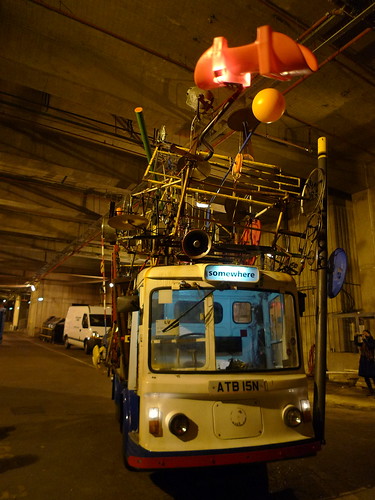
On the contrary, KAF was well hidden from the eyes of the pedestrians. Probably not entirely their fault due to the location of the venue is deep inside the plot and below street level, but I do remember it has taken me some time to figure out the way in last year. The organiser probably has identified this as well, and they have brought a spectacular moving milk float around town and on the media to get more publicity -

The milk float by Ben Parry & Jacques Chauchat (video link)

Apart from the regular exhibitor booths, both fairs have developed a series of special programmes to provide more fair-specific experience to their audience. LAF has ArtProjects which showcased 25 emerging artists/projects & Photo50 with works selected by a distinguished panel. KAF has teamed up with Cyber Sonica in its performance line-up, and held a section called Kinetic Masters showing vintage art pieces from advocates of kinetic installations.

Live performance by Musion Academy (video link)

It was the first time I attended LAF so I couldn't compare it with my past visits. But for KAF, I had a feeling the performance section has become more prominent and features a greater variety of acts. And the stage this year has involved more complex set-up which makes the performances even more enjoyable. Unfortunately the exhibitor booths do not live up to the same standard/expectations. Some of the works are fairly fancy/gimmicky without the real fun element. Having said that, there are still some truly delightful pieces around, such as these two -

Generator by Rudolf Pacsika (video link)

Flutter by Cinimod Studio (video link)

I also found there are only 2 or 3 exhibitors showing interactive / electronic art pieces in LFA. Considering we are living in the world of facebook & twitter, apple & google, and this is "London's" art fair which the city has a fame of avant garde and cutting edge tradition on its creative industry, it is slightly disappointing. Whether this is the problem of the organiser, the exhibitors or just the general economic climate; I do not know.

Full set of London Art Fair 2010 photos here
Full set of Kinetica Art Fair 2010 photos and additional video clips here

Ocean of Light by Anthony Rowe, a sonic-sensitive LED matrix (video link)

Peal by Monomatic (video link)

Further Readings -
Official website of London Art Fair
Official website of Kinetica Art Fair
The Kinetica Art Fair 2010 Picture Gallery at the Telegraph
Art fair prices even fairer this year by Arifa Akbar for the Independent, 15.01.2010
Review of London Art Fair by Oliver Basciano for artreview.com, 14.01.2010
Underwhelming show hides its greatest virtues from sight by Rachel Cloughton for journal-online.co.uk, 05.02.2010 
Interactive art on display at the Kinetic Art Fair by BBC news, 05.02.2010
Kinetica Art of the Future by Herbert Wright for Blueprint, 08.02.2010
Official vimeo of Kinetica Museum

kinetica art fair 2010 - part 1

Kinetica Art Fair
04-07.02.2010
Ambika P3 Gallery
The jean tinguely-like milk float at the entrance

Kinetica Art Fair returns to London after its acclaimed debut last year. There are more live performances than last year, and from the turnout of the VIP preview this evening, interest is definitely huge among the public.

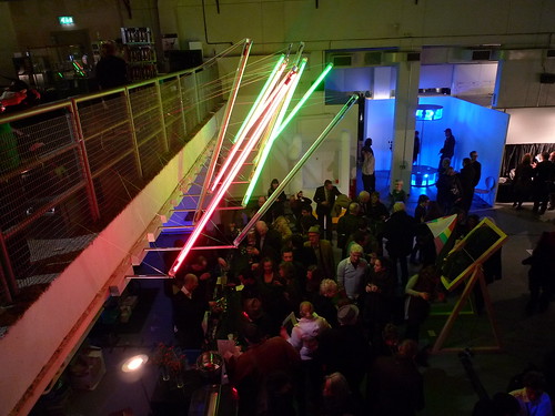
The bar area below the entrance
One of the Interactive exhibits - sonic-responsive LEDs

Apart from kinetic exhibits, there are also live performances

Read the reviews by various papers on Kinetica Art Fair's facebook page. More to come in part 2.