Further Reading -


Further Reading -
Banksy vs Bristol Museum
13.06 - 31.08.2009
Bristol Museum
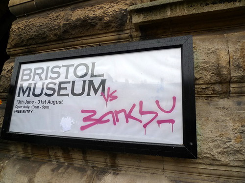 Five minutes after arriving at the exhibition venue, I asked myself, "Am I queuing for Space Mountain in Dinseyland?" There are fencings outside the Bristol City Museum with papers stating "2 hours wait from here", "1.5 hours wait from here" etc. The girls in front of me in the queue drove from Bradford, and I am sure there are quite a lot of visitors to the show are from outside Bristol.
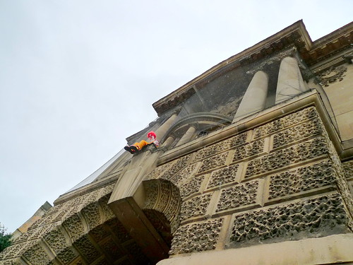
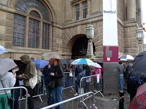
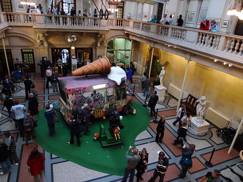
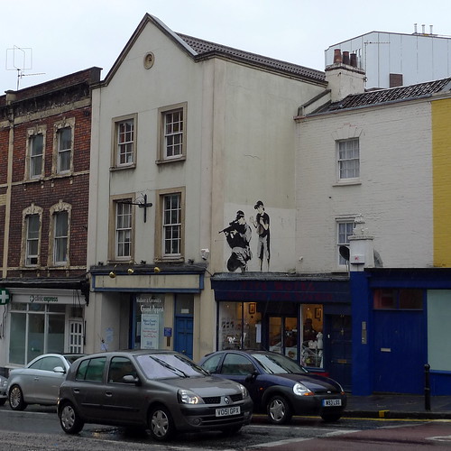
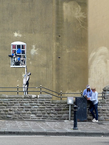
Update - Banksy insisted CCTV footage was destroyed from the Times, 13.08.2009 (via @banksynews)

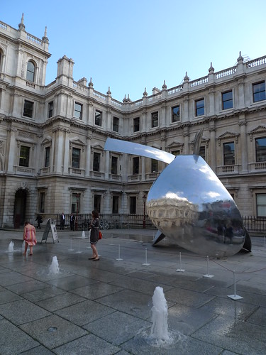
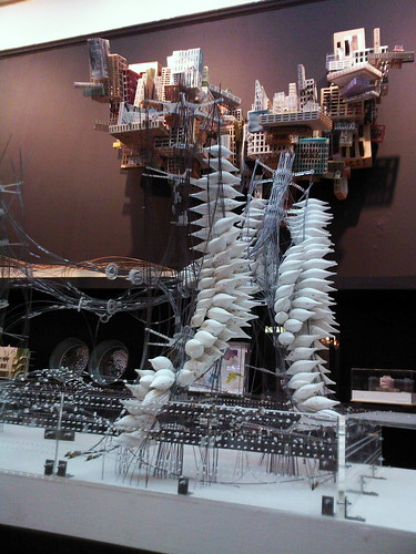
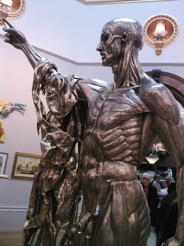
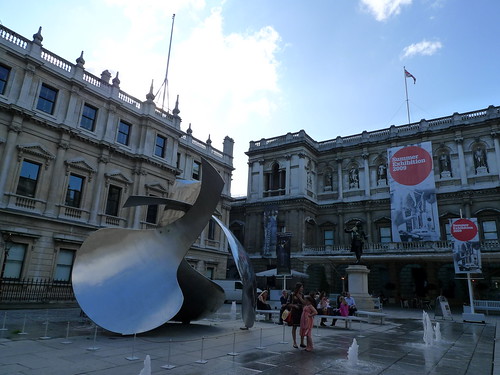 As usual, the summer exhibition in Royal Academy of Arts is promised to be a show with a great variety of works. However, I have to express my disappointment over the layout in the Architectue Room (Room VI). In the past, one could easily get close to the architectural drawings and models to appreciate the level of details they possess. Not any more this year. The room is packed like a warehouse, with 3 levels of shelves along the wall. It is impossible to reach at least 1/3 of the exhibits. Is RAA trying to accomodate as many works as possible for sole profiteering (they get 30% commission of all works sold in the show)?
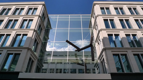
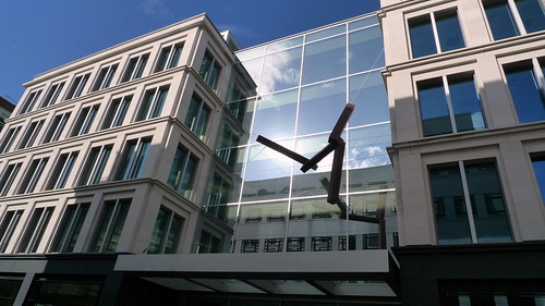 American artist Joel Shapiro was commissioned to produce an installation at the entrance of the office-retail development. His free-floating forms standing out sharply from the monolithic facade of the building. The reflective glass around produce even more drama on these 'flying' tubes.
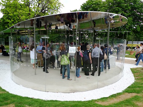
*****Serpentine Pavilion 2009
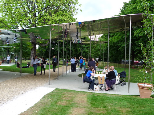
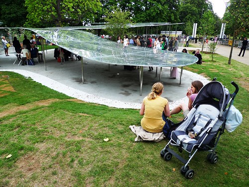
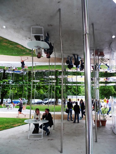
 SANAA designs the Serpentine Pavilion this year. Ryue Nishizawa of SANAA says, "The pavilion is
designed to amplify the way things look." The enormous mirror-finished aluminium roof definitely could make it happen - unless you are a blind. You see EVERYTHING twice once you walk near the pavilion, because the mirror image and its original subjects are reciprocal to each other.
You could see how the pavilion is constructed through time in this wonderful website. Now I start to feel sorry for the roof cleaners with the amount of pigeons around!
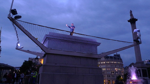


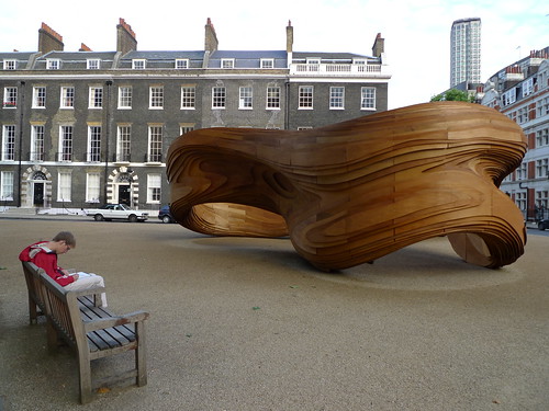

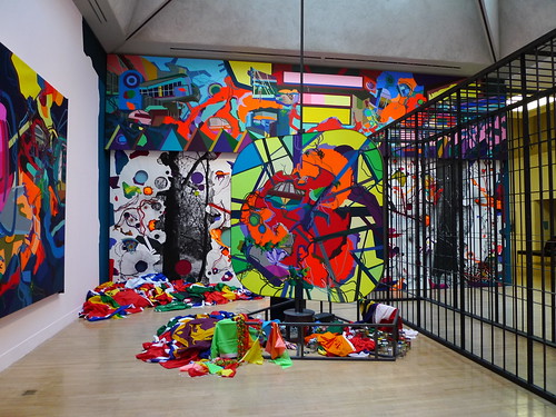

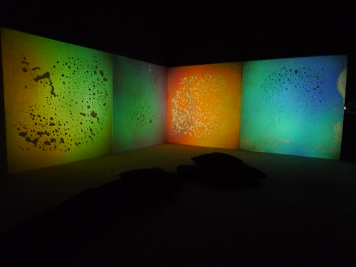
1. Landscape
2. Breathing
3. Torsion
4. Kaos
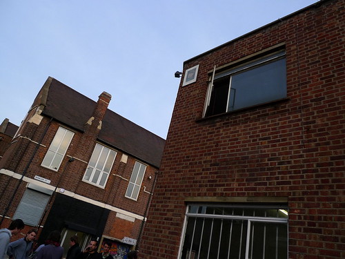

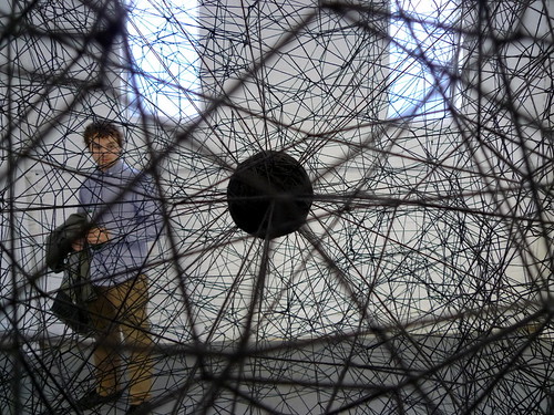

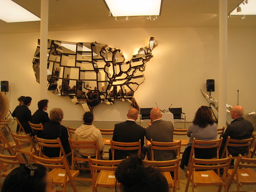

 on a saturday in march, i was taken to vyner street by a friend for a gallery tour. a 10-minute walk from bethnal green station would take you into this amazing area with so many galleries.
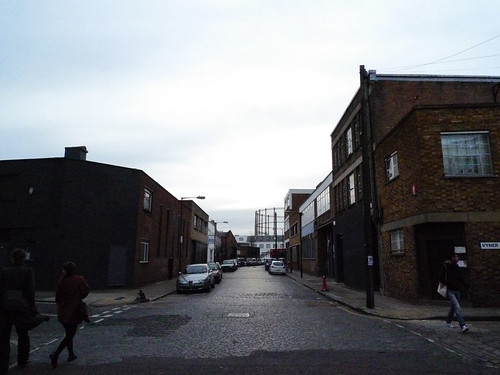
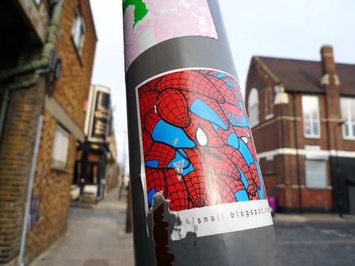 many of these galleries are only open by appointment, you ring the door bell and somebody would release the lock. this may be due to the limited resources the galleries have for security. it is like visiting private clubs and the uncertainty of what's lying behind the door and the mysterious nature adds to the excitement.
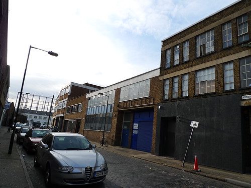
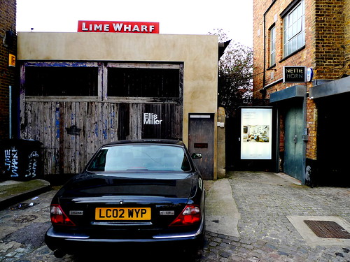 these galleries showcase a variety of works ranging from photography, paintings to sculptures, installations & video.
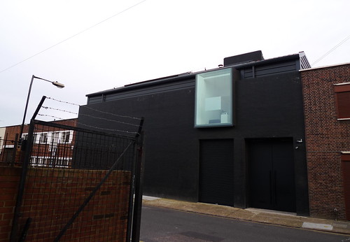 to view more photos of the galleries, goto the flickr set
 below is a list of galleries / interesting shops visited during the day. those marked with a * are my personal favourite - donlon books* . some good art books and has ACNE (the swedish denim brand) magazine on sale
IMT
monika bobinska
neon & signmakers.com
keith talent
bistrotheque
ibid projects
alma enterprises
kate macgarry
vyner street gallery
nettie horn* . the photography show is great and there is a small area in the management office displaying mataerials from previous shows
vinespace
degree art* . the building has got some great timber construction, the show viewed with icelandic artist is also very cool
artists anonymous
wilkinson* . the gallery is fitted with floor-heating!! you could feel the warm coming out from the concrete to your feet, like being soaked in a virtual hotspring! :D
fred london
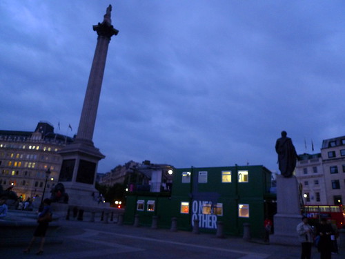
one in the other you could get a free art map from commentart.com or many of the galleries which has marked locations of almost all the galleries around the neighbourhood.
Ai wei wei's latest solo show: 4 movements was held at phillips de pury gallery. His influence on contemporary art is comparable to Damien Hirst. Being the person who introduced architects Herzog & de Meuron to bid the Beijing Olympic Stadium, he is the media icon of contemporary chinese art at the moment. 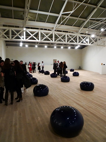
gallery reception
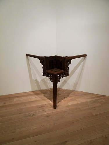
ai's signature re-interpretation on antique furniture
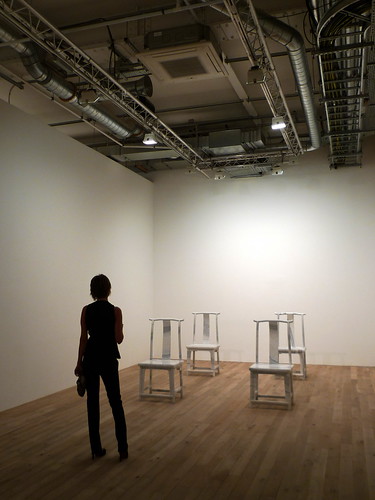
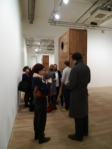
ai wei wei in conversation with wallpaper* staff
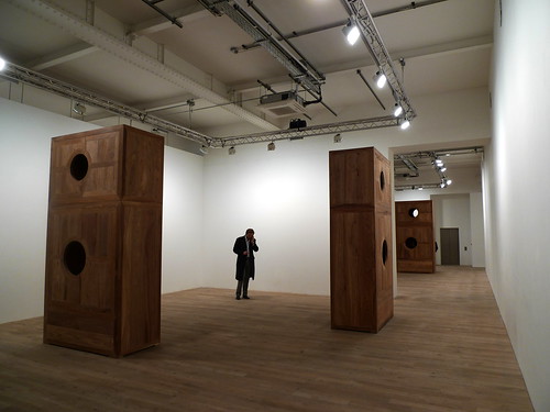
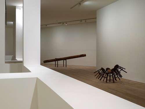
ai's signature re-interpretation on antique furnitureFurther reading -
architecture critic geoff manaugh writes on ai weiwei at his BLDGBLOG - link
ai's official website - link
wikipedia entry - link
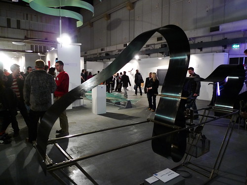

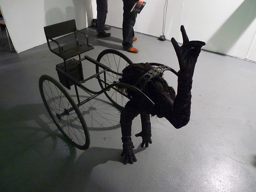
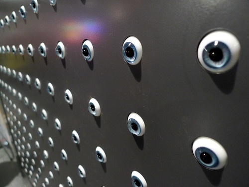

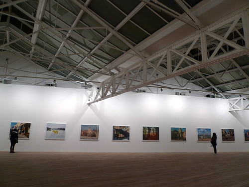
Despite the looming presence of the long nights and credit crunch in January London, the art scene is trying its best to lift people's spirits up. Museums and galleries are still offering a shelter for the people in the city to escape from the bloodbath in the job market and continuous media bombing of economic news (which becomes basically the same piece of news everyday replacing just the name of the company that went bankrupt or the figure of loss the company made). Tierney Gearon, an american former-model-turned-photographer, had her solo show Explosure at Phillips de Pury Gallery in Victoria. 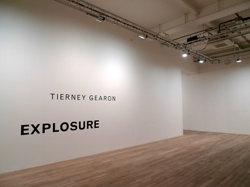 Her photos capture the magic of double exposure, and one would wonder how she made these overlapping images so perfectly without any post-production. But even if these double exposure are arranged at post-production, the persistent appearance of her children featured in many of her works displayed juxtaposing with everyday scenes provide a distorted sense/scale of time and space, as well as a level of surrealism over the exhibition even the medium used and locations shot are no other than ordinary.
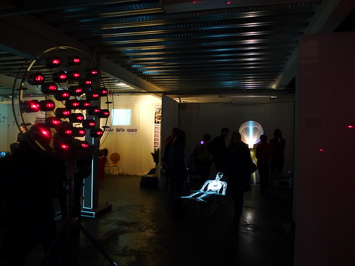
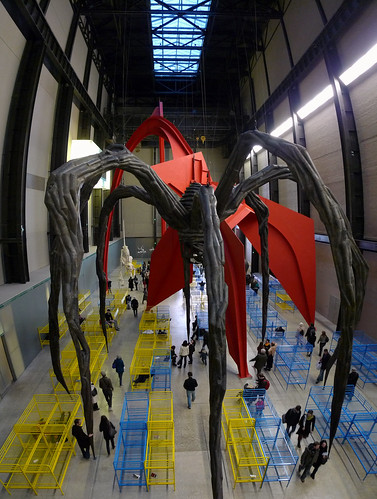
exhibition photo set hereAt Tate Modern, Dominique Gonzalez-foerster is the artist responsible for the turbine hall now. Unlike previous artists that create a centre-piece of their own in the mega-space, she performs like a curator to present a selection of other people's works in an environment she creates to deliver her message/concept (refer to the video interview in the Futher Reading link below). This is what makes it interesting or at least makes the point for this installation, called TH.2058. 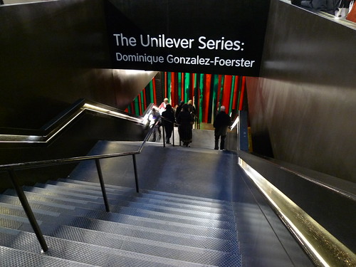 Personally I prefer the previous approach as given the scale of the space reserved for only one artist, visitors are expected to see a single piece of work inside. However, such '3D-collage' approach is nothing fundmentally different from a 2D collage picture created by many other famous artists in the past generations. Perhaps we could all learn to appreciate art in a fresh perspective. In this aspect I think Tate Modern has really stood up to its vision and curatorship to be a frontier in contemporary art. Let's see what the next Turbine Hall work would be...
insallation photo set hereFurther reading -
Tierney Gearon in wikipedia
Telegraph magazine covers Tierney Gearon's Explosure
Official page for TH.2058 at Tate Modern
Reviews of TH.2058 at www.culturecritic.co.uk
Interview clip of Dominique Gonzalez-foerster on TH.2058 by the Guardian UK